
The Problem
Design In A Vacuum
The Taurex app’s initial UX/UI falls short of user expectations, with challenges in navigation, feature accessibility, and displaying complex financial data. Users were frustrated by clunky interactions and outdated visuals, which lowered engagement and lengthened onboarding times. The redesign aims to streamline navigation, improve mobile usability, and present financial data more clearly — ultimately enhancing user satisfaction, retention, and overall app performance.
The Solution
Strategy Backed Approach
The Taurex redesign prioritizes a user-friendly, streamlined interface with simplified navigation and enhanced feature accessibility. By improving the mobile experience and presenting financial data in a clearer, more digestible format, it will better serve both new and experienced traders. Modern visuals and smoother interactions will boost engagement, reduce user frustration, and ultimately drive higher satisfaction, retention, and more efficient use of the app.

Initial Designs
Before The Rebrand
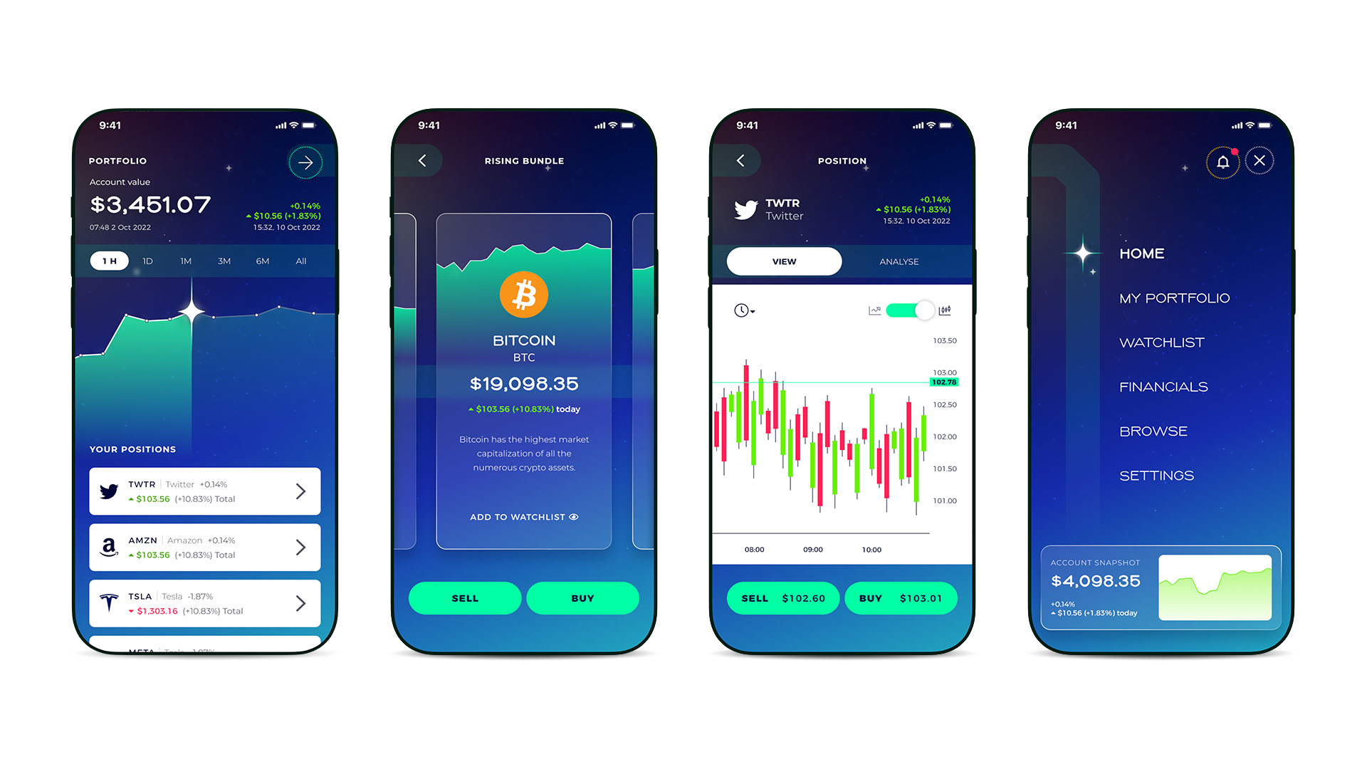
Before the rebrand and strategy were finalized, early versions of the Taurex app lacked direction. With no clear goals or cohesive brand, the app suffered from inconsistent design across screens and visually overly complex features that confused new traders. The lack of a unified design system meant that colours, typography, and icons didn’t align, creating a disjointed user experience. These missteps made the app difficult to navigate and use, highlighting the need for a complete overhaul to achieve clarity and cohesion.
New Look & Feel
Time To Get Involved
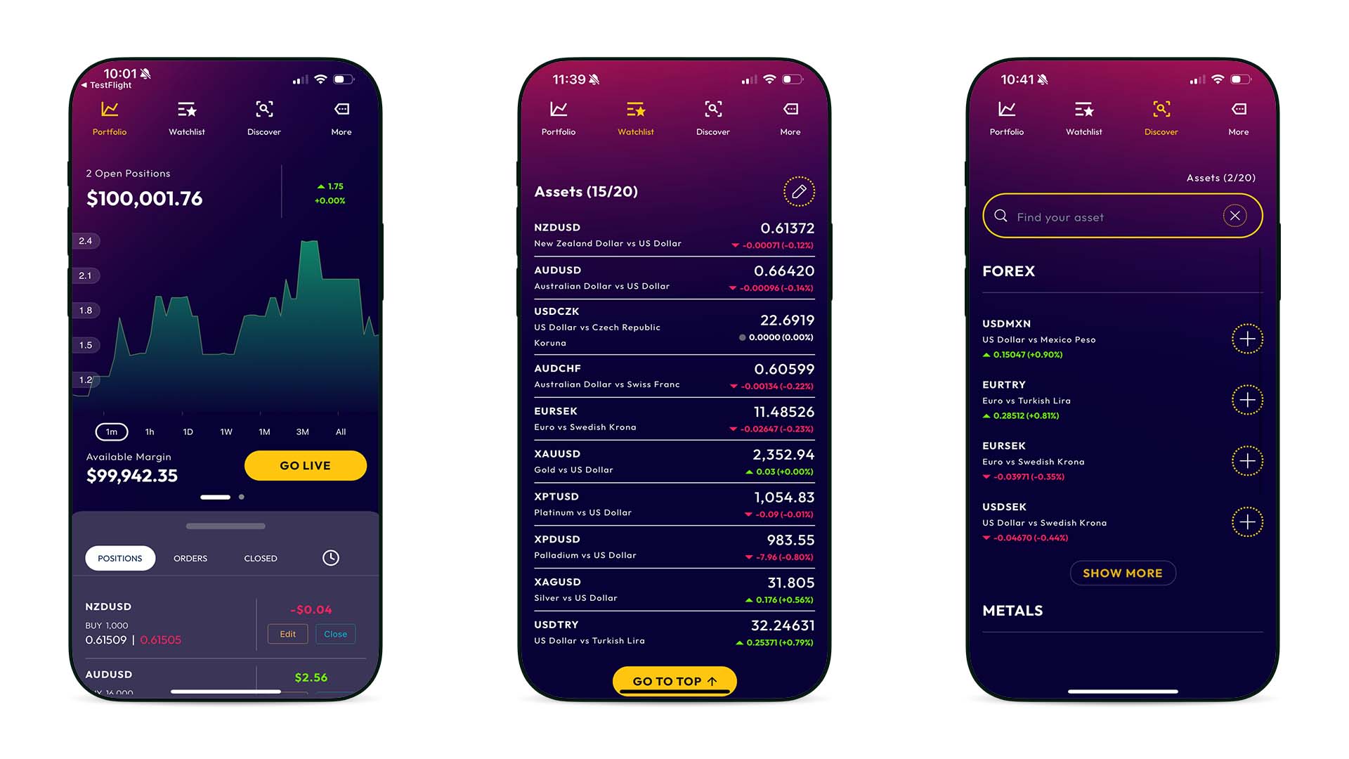
Once the new brand was established, we revisited the app with fresh eyes. We started by conducting user interviews and quickly applied a branded “skin,” updating colours, typography, and making initial redesign tweaks. This allowed us to rapidly pinpoint problem areas and take action to improve them.
Portfolio
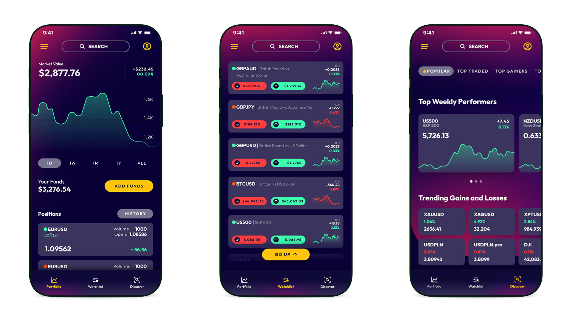
The portfolio section was redesigned to deliver key insights at a glance. By decluttering the UI, restyling crowded elements, and removing redundant content like 2 Open Positions — the interface became cleaner and more intuitive. Eliminating the position drawer created more whitespace and streamlined development. Position cards were unified into a single feed with status tagging for easier tracking, and high-value data such as volume and position size were added to enhance user insights and improve overall portfolio management.
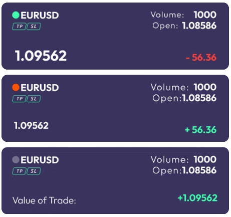
Trade rows were consolidated into a single view, allowing users to easily scan all positions. A beginner-friendly, colour-coded status system was introduced: Green for Open, Orange for Pending, and Grey for Closed — making trade tracking intuitive at a glance.
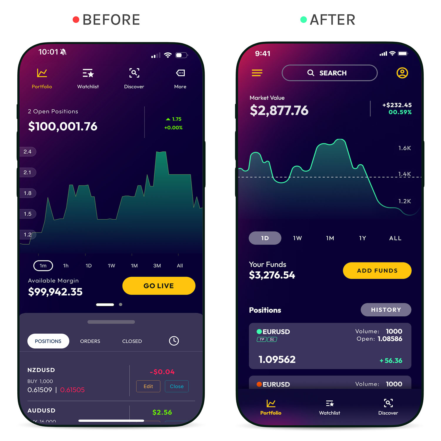
Before
- Crowded elements and a cluttered UI competed for attention
- Redundant content repeated what the feed already showed
- A separate position drawer ate whitespace and build time
- Trade rows were split across views, so nothing scanned at once
After
- Position cards unified into one feed with status tagging
- Dropping the drawer freed whitespace and simplified the build
- Volume and position size surfaced for sharper insight
- Colour-coded states make tracking readable at a glance
Watchlist
The Watchlist section was redesigned to better inform users and prompt quick actions. Status indicators now provide at-a-glance updates on whether an asset has open, pending, or closed positions. A chart was added to visually highlight recent market changes, with relevant data displayed alongside for easy reference. The Buy and Sell buttons, now more prominent and including real-time price info, make it easier for users to act swiftly on opportunities.
Insights & Takeaways
For many traders, ‘live’ information is a compelling call to action. 60% felt coloured buttons for Sell / Buy have value for them.
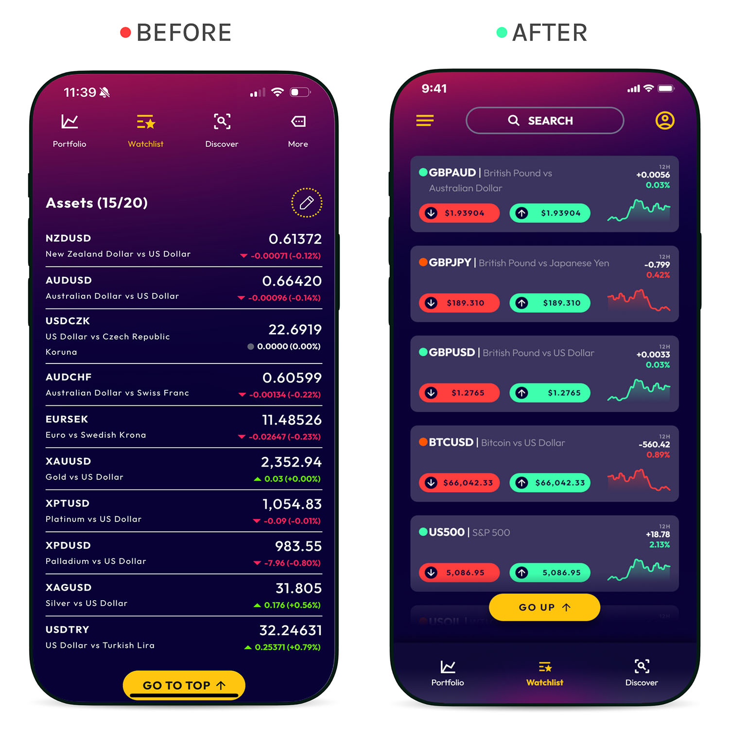
Before
- Vital information was unclear or missing
- Calls to action were weak or absent
- Position selection (Buy vs Sell) lacked clarity
- Data points were simplistic, missing valuable context
After
Asset cards were rebuilt around real-time Buy/Sell CTAs.
- Real-time Buy and Sell buttons on every asset card
- Charts with time-scale options for deeper insight
- Data grouped to show relationships more clearly
Discover
The Discover page serves as a gateway to insights and trends. High-value category filtering was introduced using interactive, scrollable cards to boost engagement. A quick-filter and tab system was added to prioritize key categories and surface the most relevant data for traders. Various display methods were tested to enhance visual appeal and establish a clear information hierarchy. Structural adjustments ensured critical data is now prominently displayed above the fold, making essential content instantly accessible to users and driving more informed decisions.
Insights & Takeaways
Users valued recommendations such as trending or biggest mover.
“Having thoughtful recommendations is very powerful. This is much more useful.”
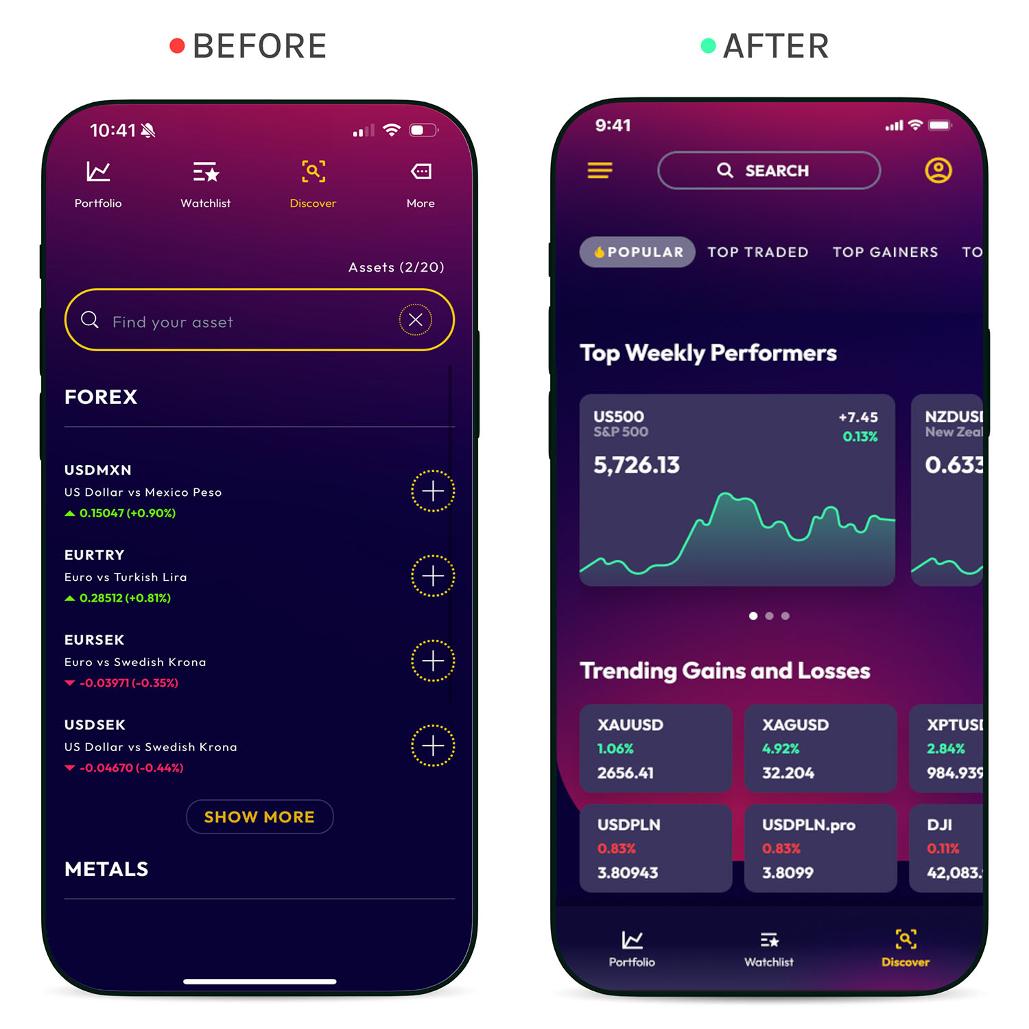
Before
- Visual design lost out to constant high-demand data pulls
- Users found the page uninspiring and low value
- Tiered categorization buried content behind excessive scrolling
After
- Category filtering cut live data load and eased backend strain
- Variable card sizes added visual interest, aligned to IA best practice
- Purpose-driven UX writing sparked curiosity and engagement
Ordering
The manual entry field was redesigned to handle larger amounts, adding a slider for quick position size adjustments. Stop Loss, Take Profit, and Partial Close fields were optimized for easier access, reducing the need to scroll. The content now focuses on key data to inform trades, while button UI was updated to accommodate a wider range of assets and prices. The Buy/Sell toggle was also enhanced to support up to 9 numeric characters, ensuring smoother transactions for all users.
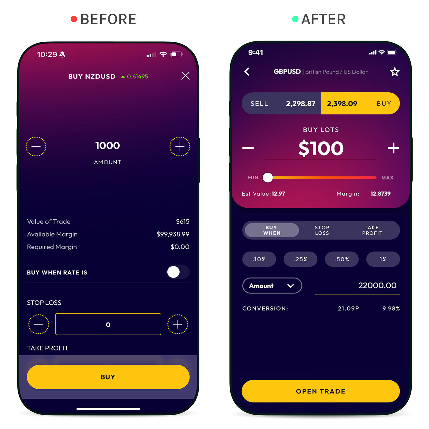
Before
- Essential content was buried below the fold
- Missing information made some settings unclear
- Beginners couldn’t tell how settings affected their position
After
- A less technical visual style, for broader appeal
- A slider made trade size easier to adjust
- All settings moved above the fold for immediate feedback
- Layout optimized for better use of space
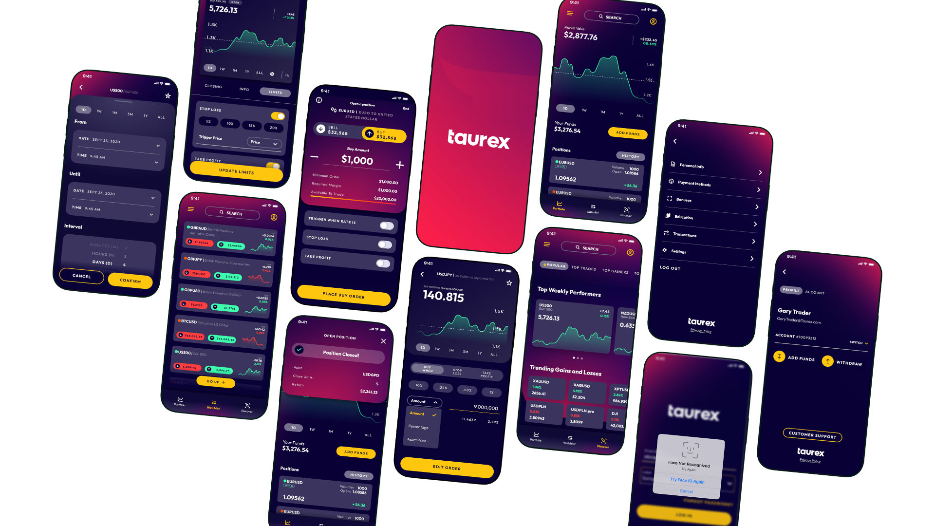
Innovation Through Insight
Innovation begins with curiosity—driven by research, competitor analysis, and strategic exploration. On the Taurex app, this meant identifying future opportunities through user insights, market trends, and unmet needs. Early discovery work shaped forward-looking concepts, guiding iterative design and testing to unlock new value for users.
Innovation Goals
The innovation workstream took a test-and-learn approach to uncover opportunities that set Taurex apart from competitors. Efforts were focused on two key pillars: Build Loyalty & Foster Financial Confidence.
How To Get There
Data-backed insights revealed industry context and business goals that shaped UX & design direction. Concepts were tested early to evaluate impact before implementation.
Building Customer Loyalty
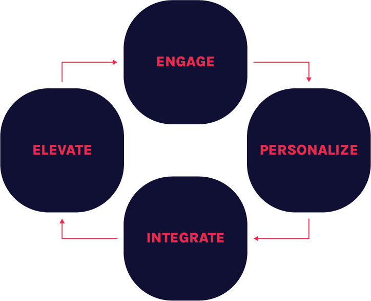
Loyalty is built through a strategic framework of four pillars:
- Engage: Referral bonuses, deposit incentives, challenges, and leaderboards
- Personalize: Tailored rewards based on behaviour and preferences
- Integrate: Loyalty programs, VIP rewards, and value-based bundles
- Elevate: Social features, community tools, and learning modules
Competitor Research Insights
To support innovation, a UX research workflow was set up to gather insights from both users and the products they use. Through interviews, surveys, and usability testing, we uncovered key pain points and unmet needs. Competitive and adjacent product analysis added context around user expectations and market trends. With this information, we ran product and feature audits to spot gaps and surface opportunities worth exploring within the Taurex app. This approach helped focus future feature development on what matters most to users.
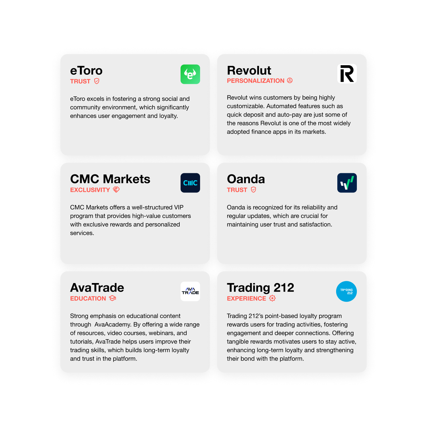
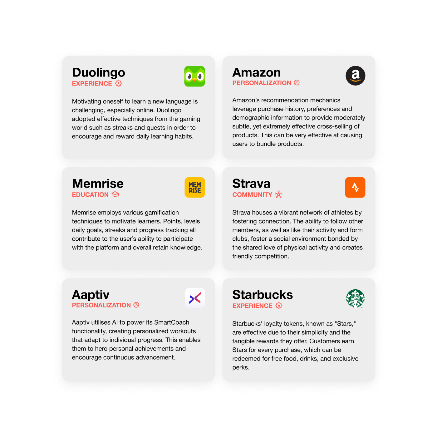
Strategic Opportunities for Loyalty & Engagement
These themes were uncovered through user research, competitor analysis, and market exploration, highlighting where Taurex can deliver differentiated value and drive deeper engagement.
Loyalty Through Competitive Fees & Spreads
Reduced fees or tighter spreads for loyal users can serve as a strong differentiator.
Educational Rewards for Skill-Building
Offering bonuses or points for completing advanced educational content helps users grow while reinforcing platform loyalty.
Referral Bonuses for Forex Traders
Trader-specific referral incentives can drive growth and build a stronger, more engaged community.
Milestone-Based Loyalty Programs
Rewarding users for hitting trading milestones encourages continued engagement and active trading.
Personalized Trading Recommendations
Tailored trade suggestions offered as loyalty perks can deepen trust and add real value for experienced users.