The Problem
Strong Product. Weak Presence.
“Love this product” , “This vegan Hunnie is incredible” , “If you haven’t tried this product yet, you must!” These are the types of reviews that flooded in from consumers. The product itself was not the issue — the fact that they had a great product that wasn’t being taken seriously, was. Retail was overlooking them and growth had stalled.
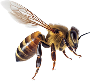
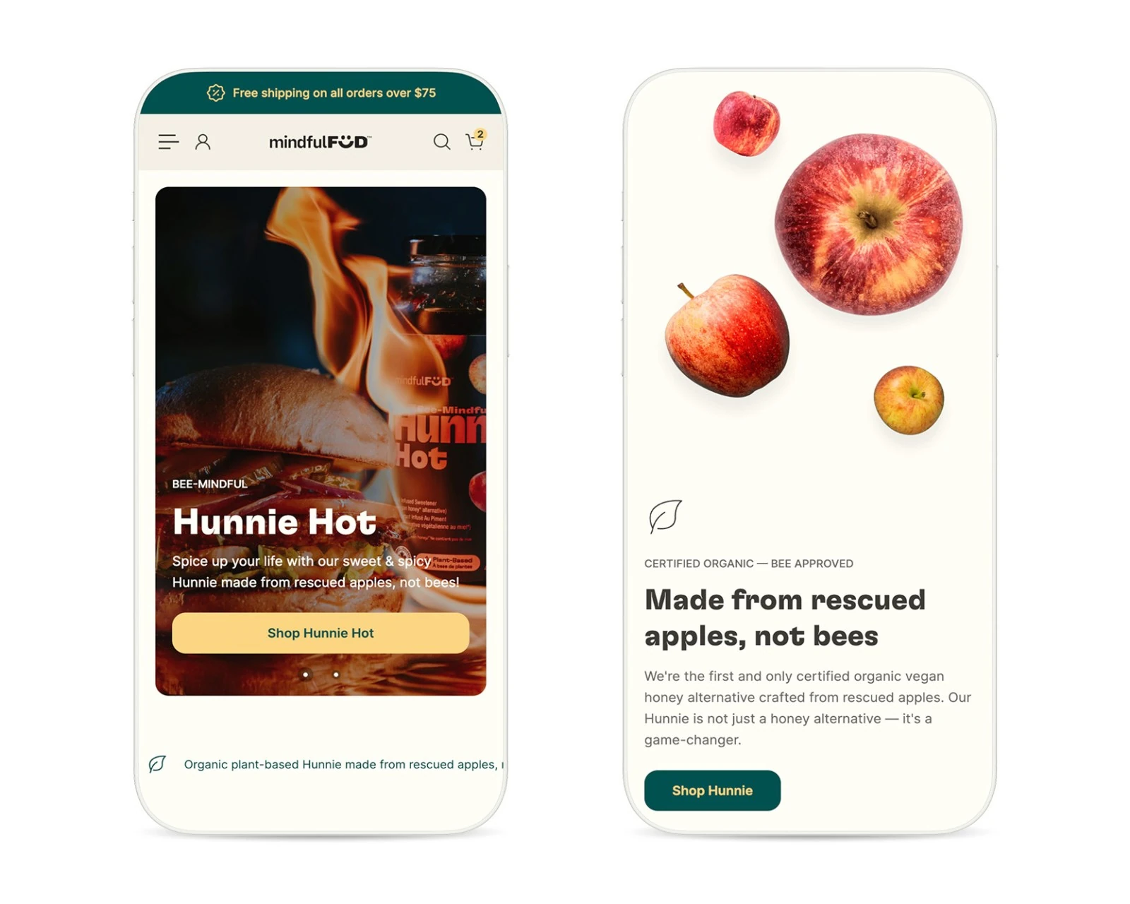
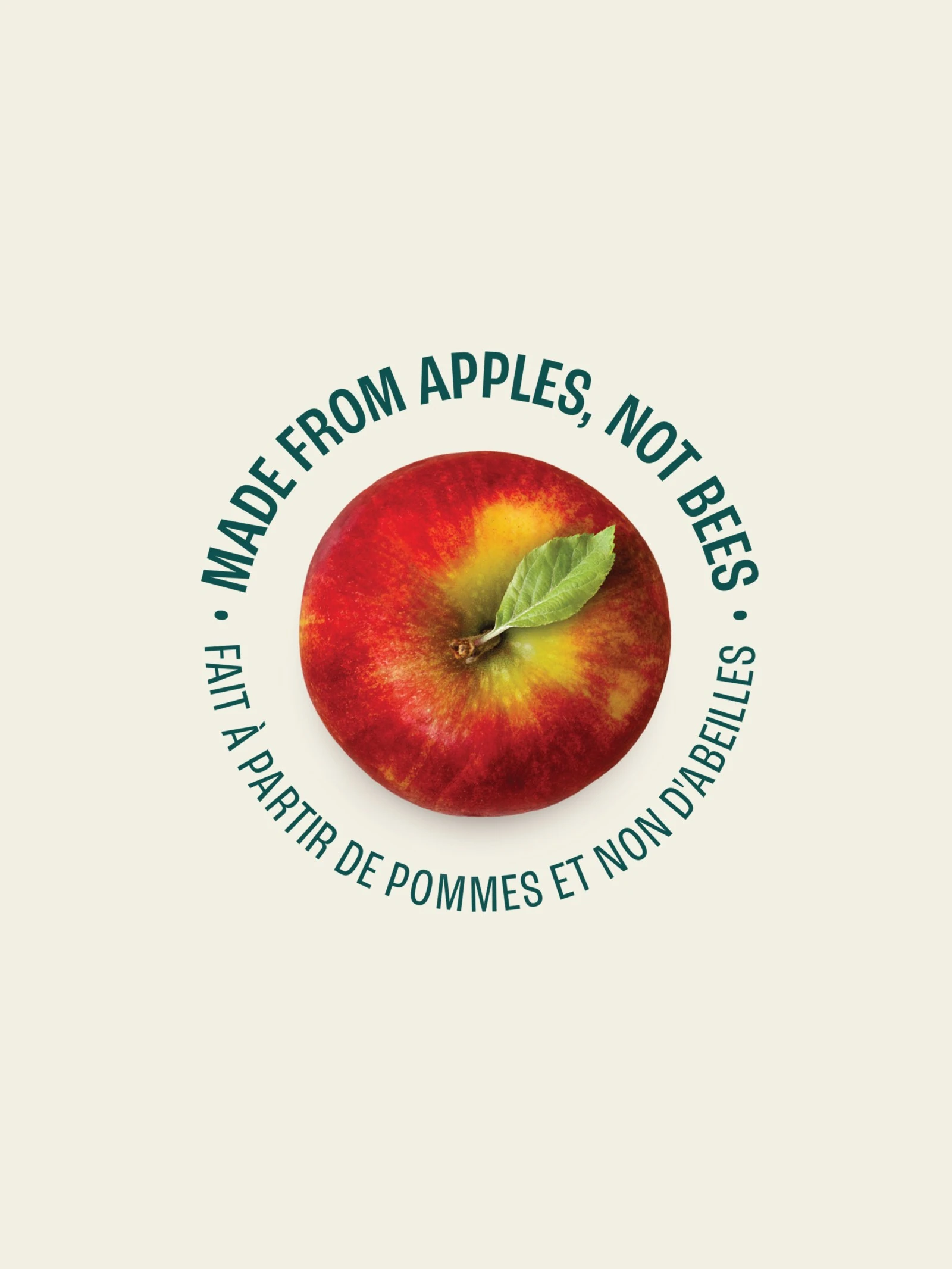
Made from rescued apples, not bees
Business Plateaued
The verdict was clear, when people tried the product — they loved it. They raved about the test and its seemingly endless uses, but the brand made it seem too small-scale. As a result, people didn’t take it as seriously, viewing it as a niche or local product rather than a premium offering.
The Solution
It Was Time For a Change
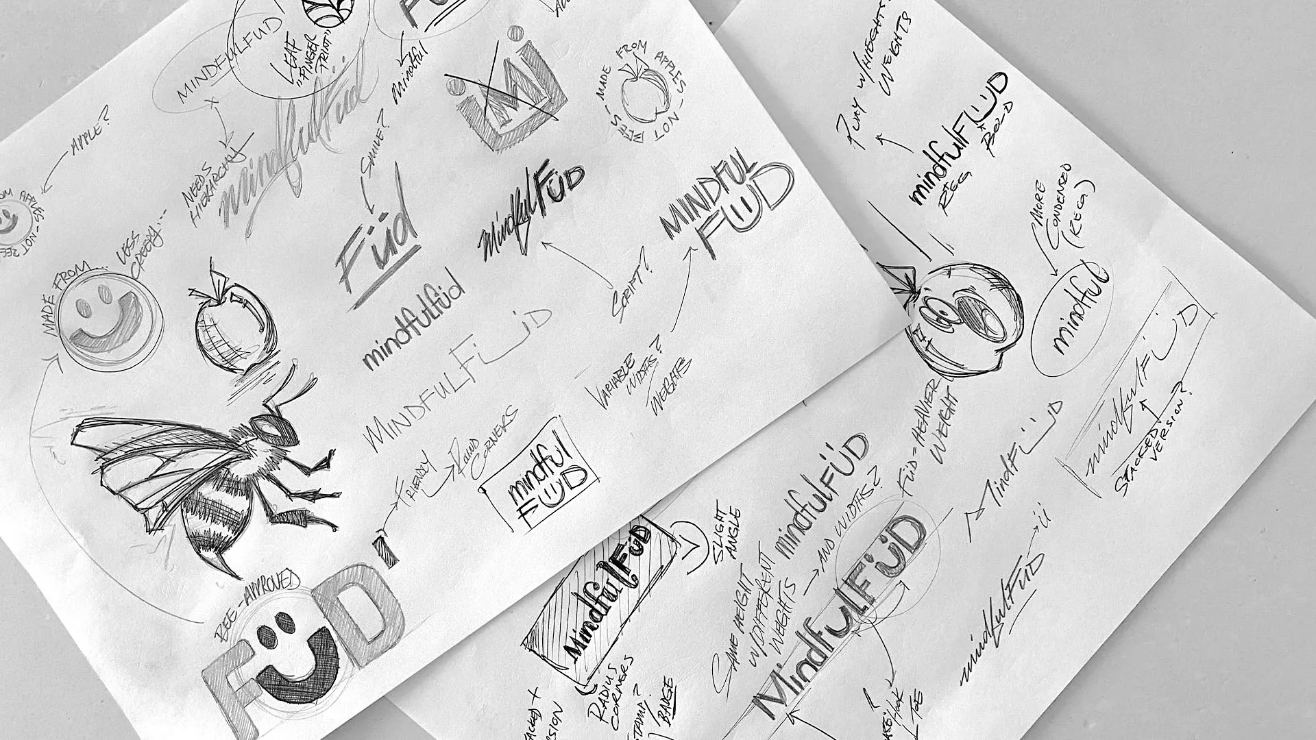
The brand needed a push, something to stand out on the shelves and attract customers. Using consumer insights, we worked through several different directions before landing on the one that fit — which, in the end, was the first concept.
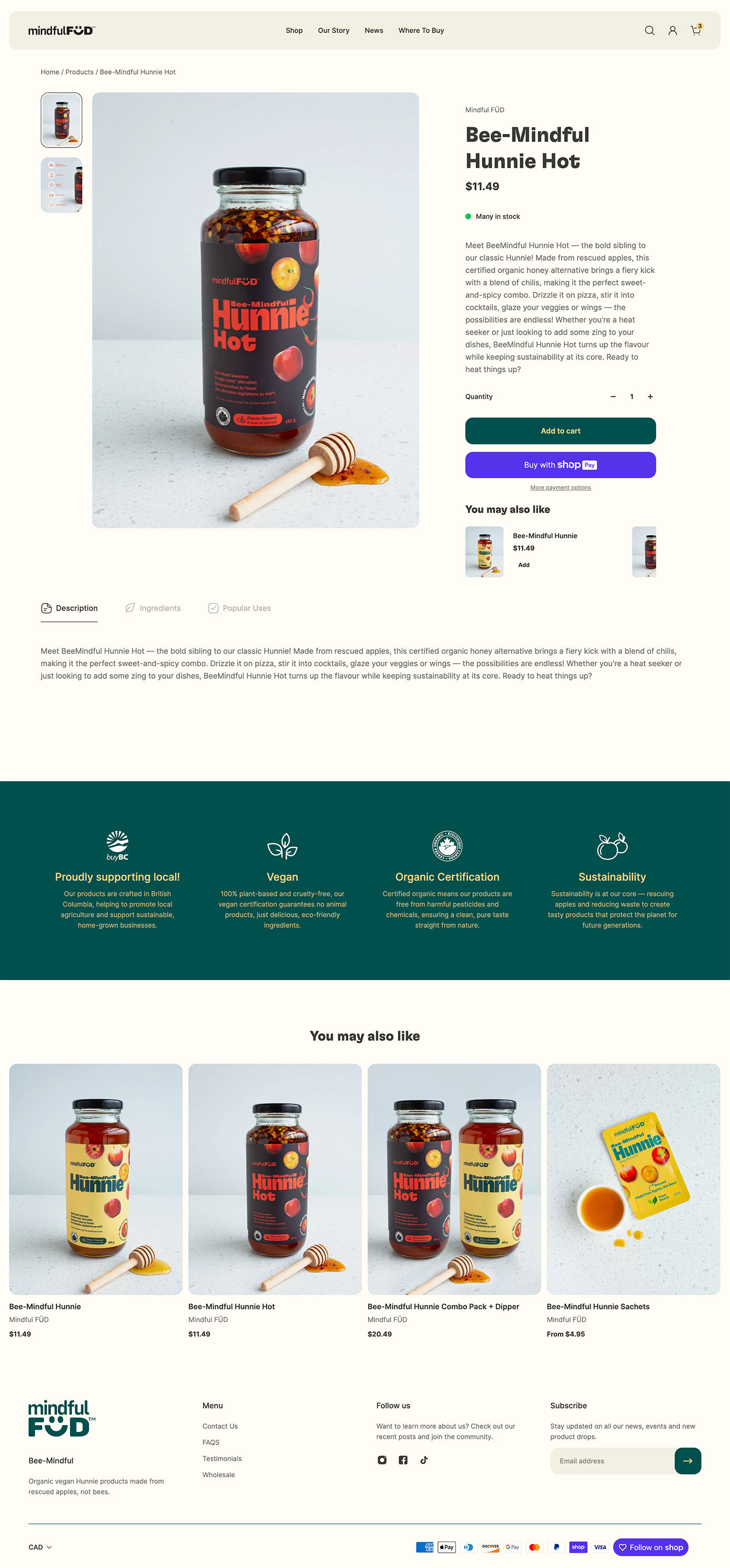
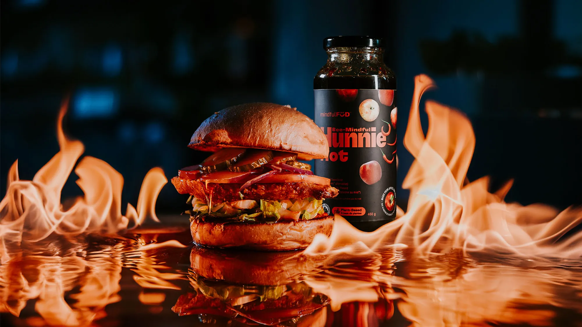
Set with a new logo, custom icons, a fresh new colour palette and approachable but uniquely memorable brand fonts. The new brand was rolled out across all of the products.


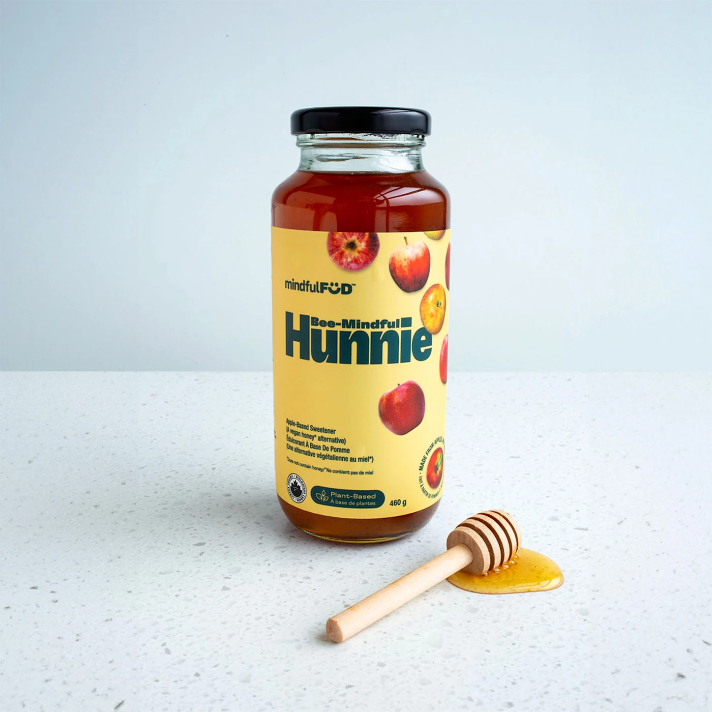
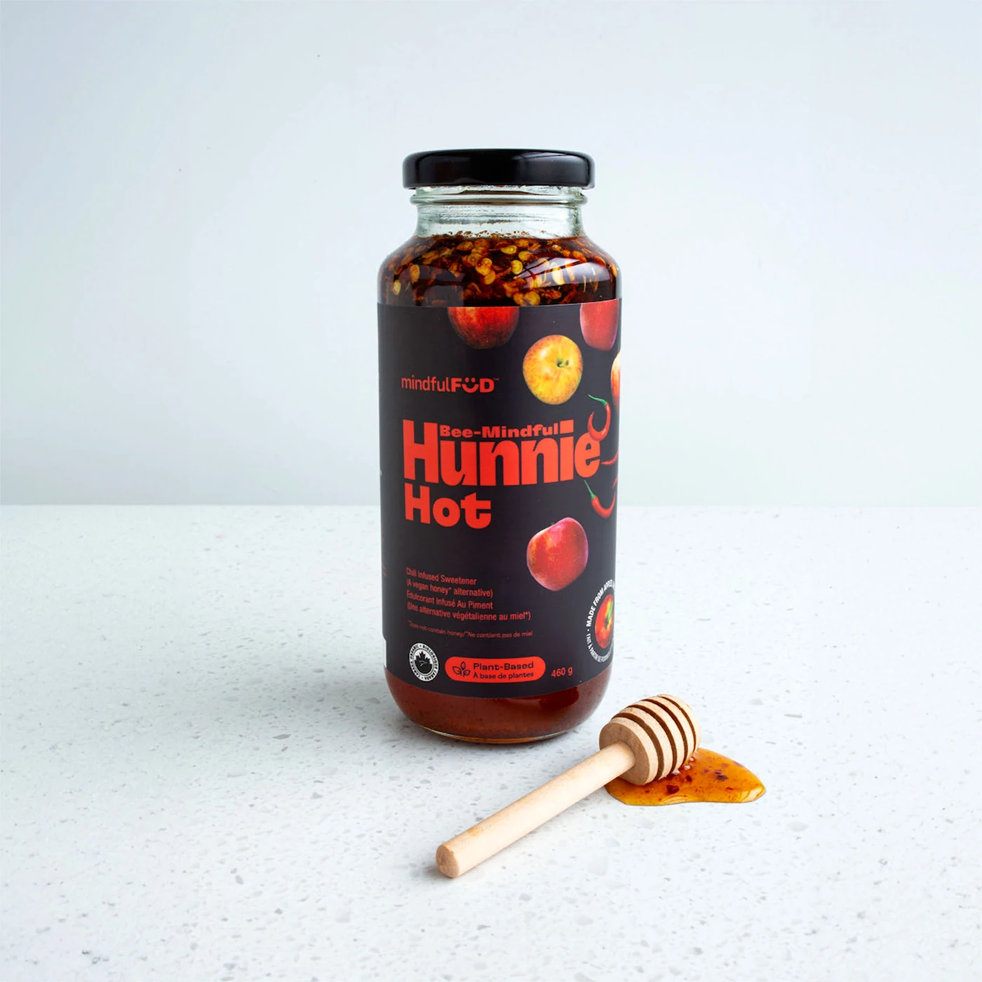
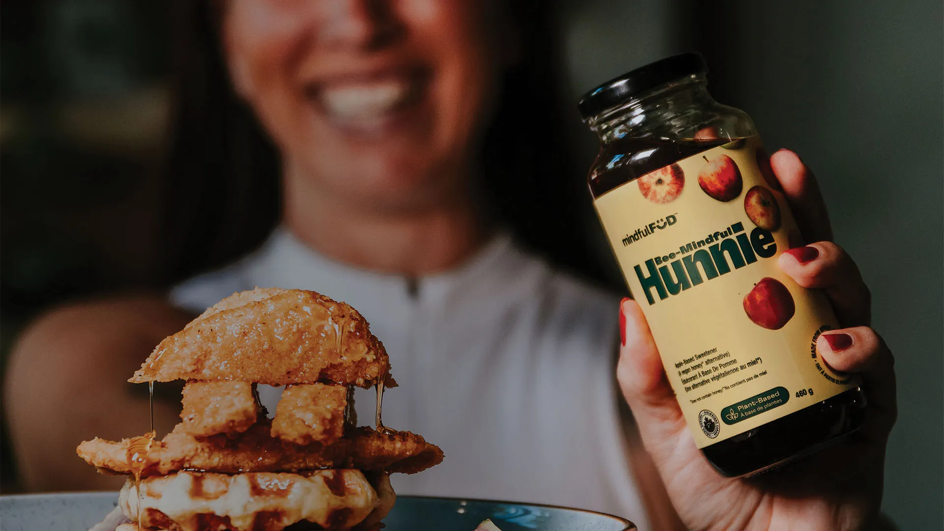
“The fresh new labels have really helped the product stand out on the shelves. Customers are drawn to the clean, modern design and the eco-friendly messaging. It’s making a noticeable impact on sales!”
“Since the rebrand, we’ve noticed more customers engaging with the product. The new labels clearly communicate the unique, sustainable qualities of Mindful FÜD, making it a standout on our shelves.”
“The new look of the BeeMindful Hunnie is a game changer in our store! We loved it so much, we made room for them in several places around the store to showcase them!”
All New Everything
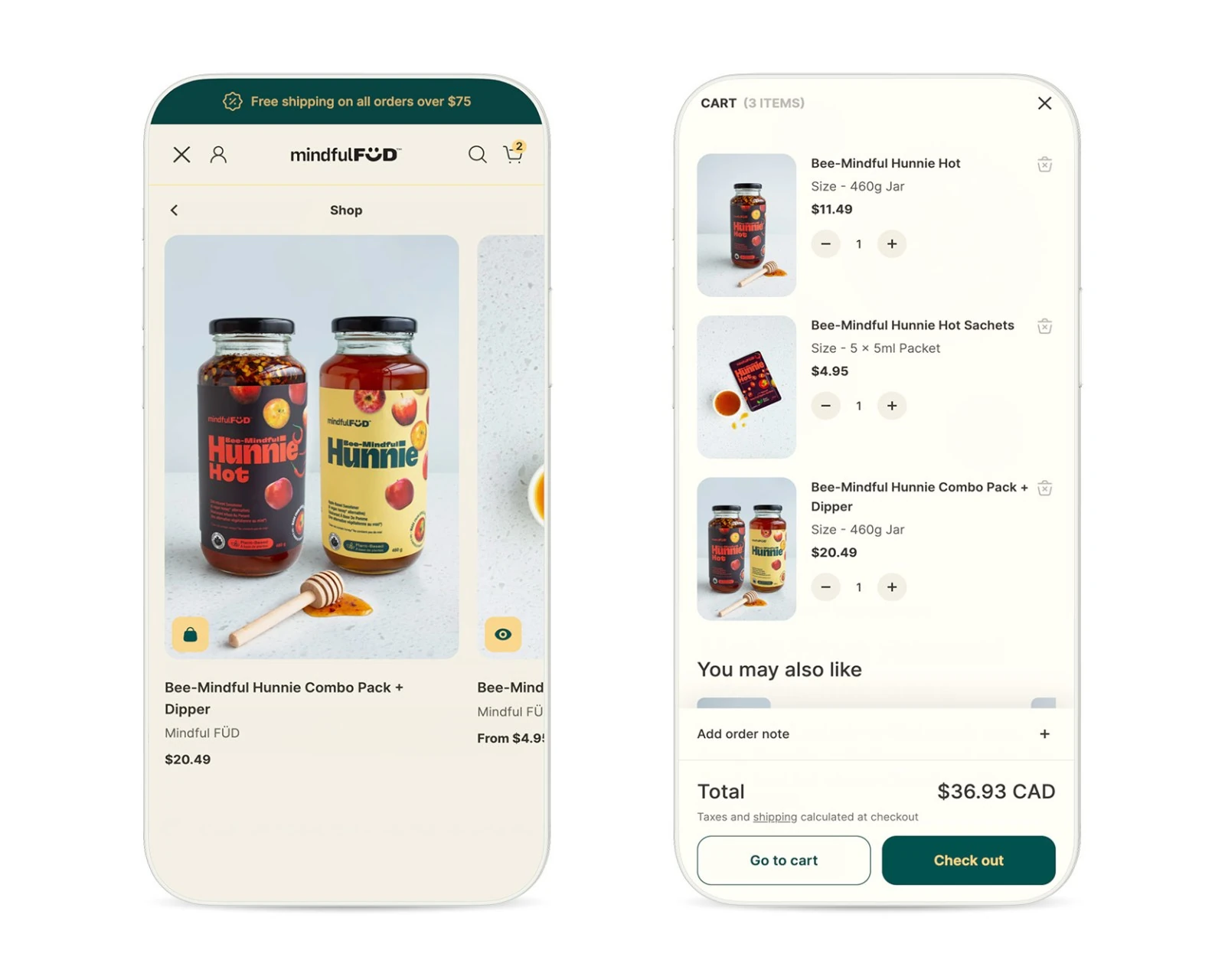
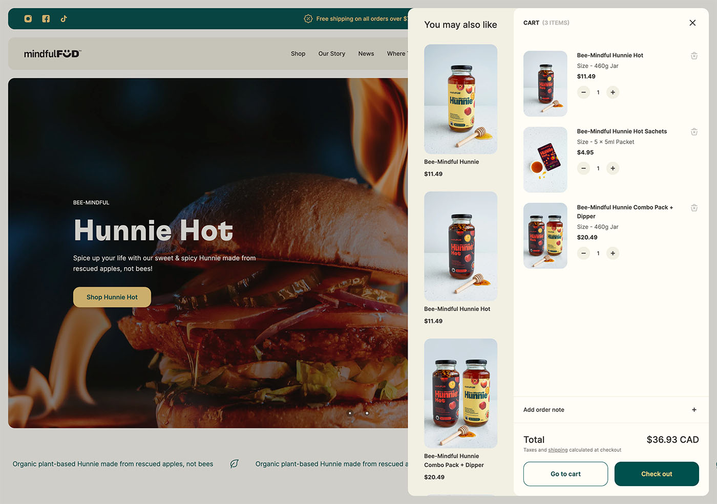
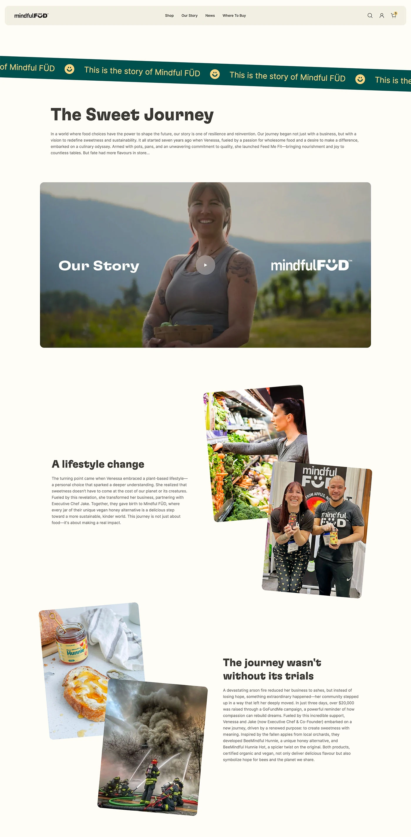
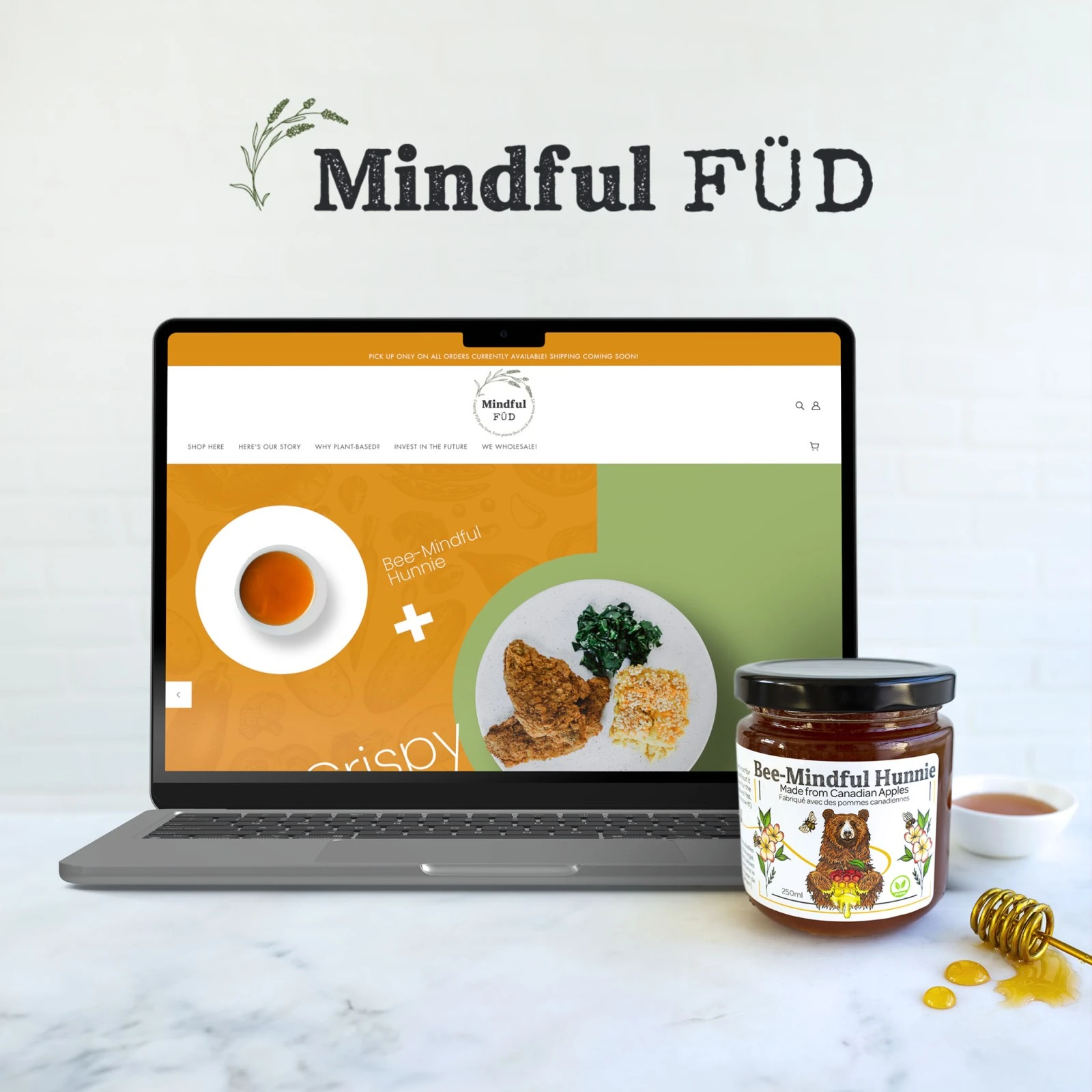
The e-commerce experience was completely overhauled, resulting in a transformative and impactful user journey. The new look not only reflects the brand’s updated identity but also fosters a more cohesive and engaging shopping experience. By elevating consistency across all brand and product touchpoints, mindfulFÜD now offers a far more immersive user experience, increasing engagement and driving customer loyalty.
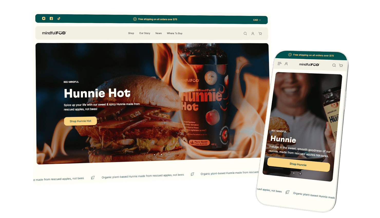
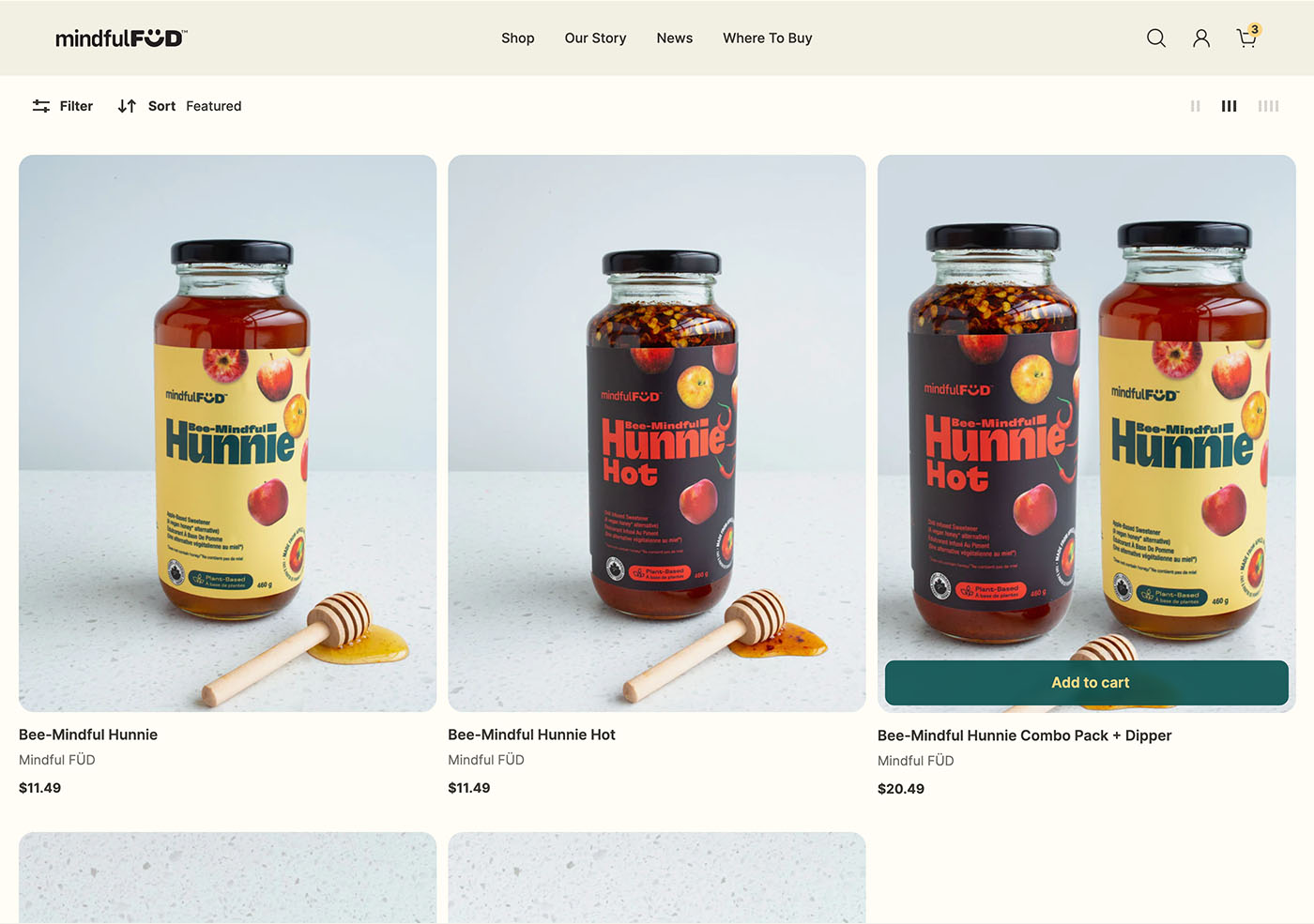
Visual Product Menu
Emphasizing the new brand and products in the Shop menu enhances the shopping experience by allowing customers to connect with the products quickly. Creating an intuitive and engaging browsing experience helps customers make faster decisions based on visuals and text rather than text alone — which helps to increase conversions, builds trust, and encourages purchases.