The moment it started
An app that identified a charger as a bird
With an early build, I pointed Spotter at a phone charger sitting on my desk. It came back White-crowned Sparrow, clearing the confidence floor and the margin over the runner up. Not a close call. A confident, specific, completely wrong answer.
This wasn’t something I could tune my way out of. The model has one class per bird in the game, and every one of them is a bird, so it has no way to say “that’s a charger.” It spreads its belief across species instead, and it’s often sure while doing it. No threshold fixes a model that’s wrong with conviction.
That afternoon set the brief for the rest of the project.
The constraint
A kids’ app can’t afford to lie
An adult who gets a wrong bird ID shrugs it off and looks it up. A child believes it.
That idea is behind every gate in this app. The check for whether there’s a bird at all. The three-way result, so it can offer a few names instead of forcing one. The rule that keeps the rarest birds out of guesses. It’s also why I audited the badges and found four that promised something the app never checked.
The second constraint was quieter but just as real. A kid’s phone may be a hand me down, so Spotter still supports the iPhone SE instead of raising its deployment target.
The fix was a different question
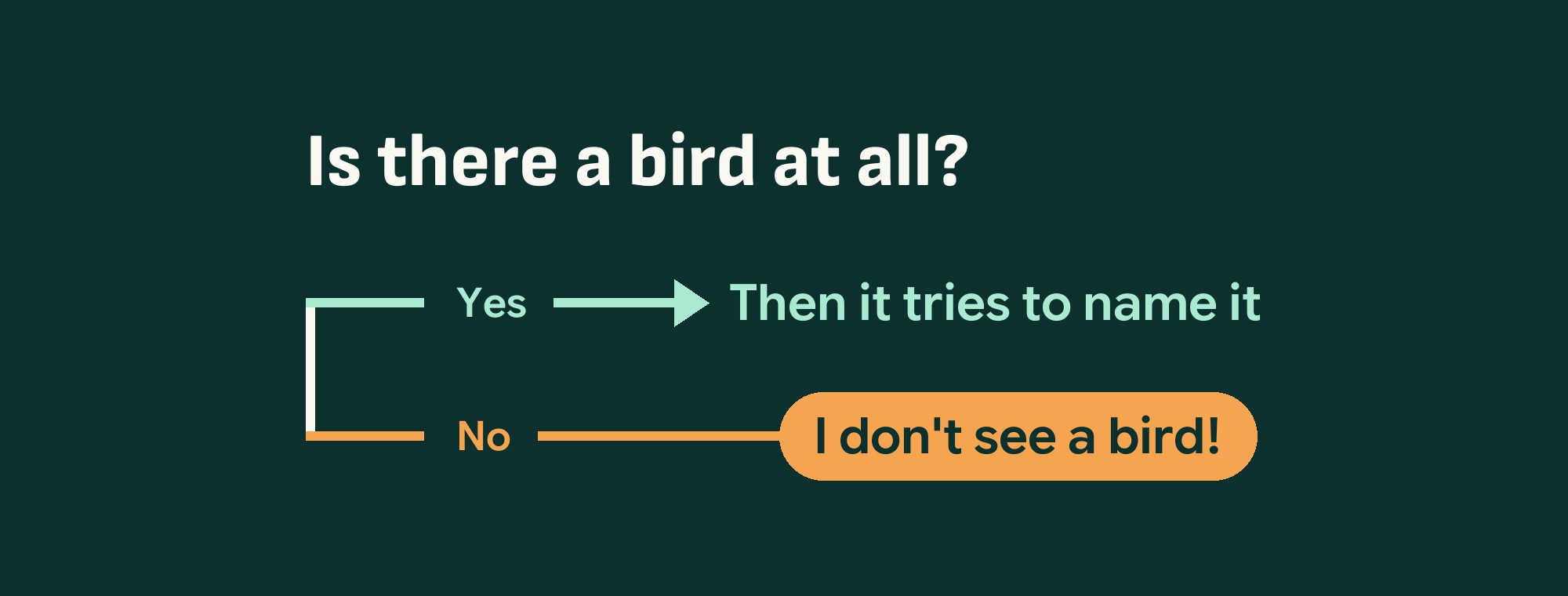
The charger got fixed by asking something else first. Before the app tries to name a bird it settles whether there is a bird at all, and three more gates sit behind that one. The same idea is built into the listening side, so a barking dog, a voice, or a one off noise is never matched to a bird.
All findable in British Columbia, across 4 regions
Every bird identifiable by photo, by sound, or both
No requests, no SDKs, no analytics, no accounts
Built in six weeks, idea to launch
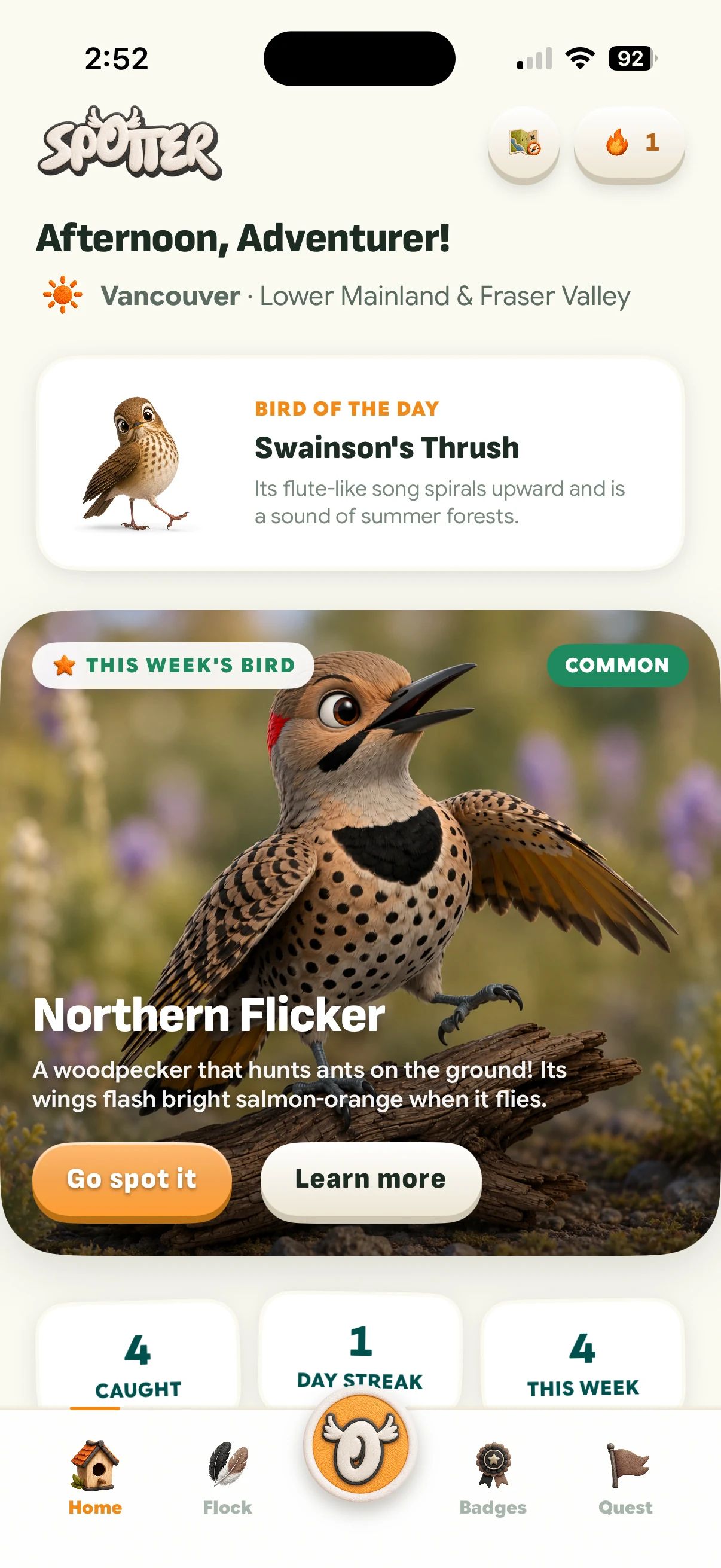
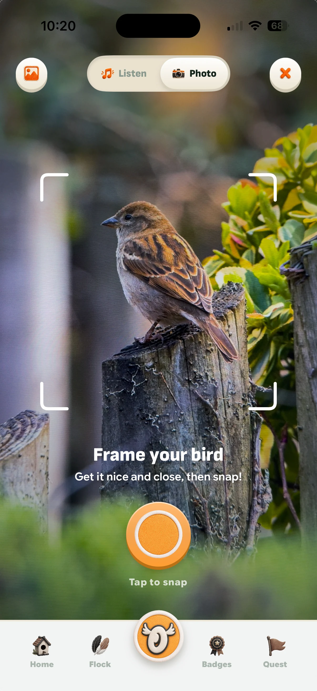
Soundscapes
One feature request kept coming during testing. The ability to call several birds from their flock at once instead of one call at a time.
So Soundscapes was built. It lets you play a mix of calls together, from any bird in your flock. Watching birds reply in real-time is the whole point, and it’s a part they keep coming back for.
The catch loop
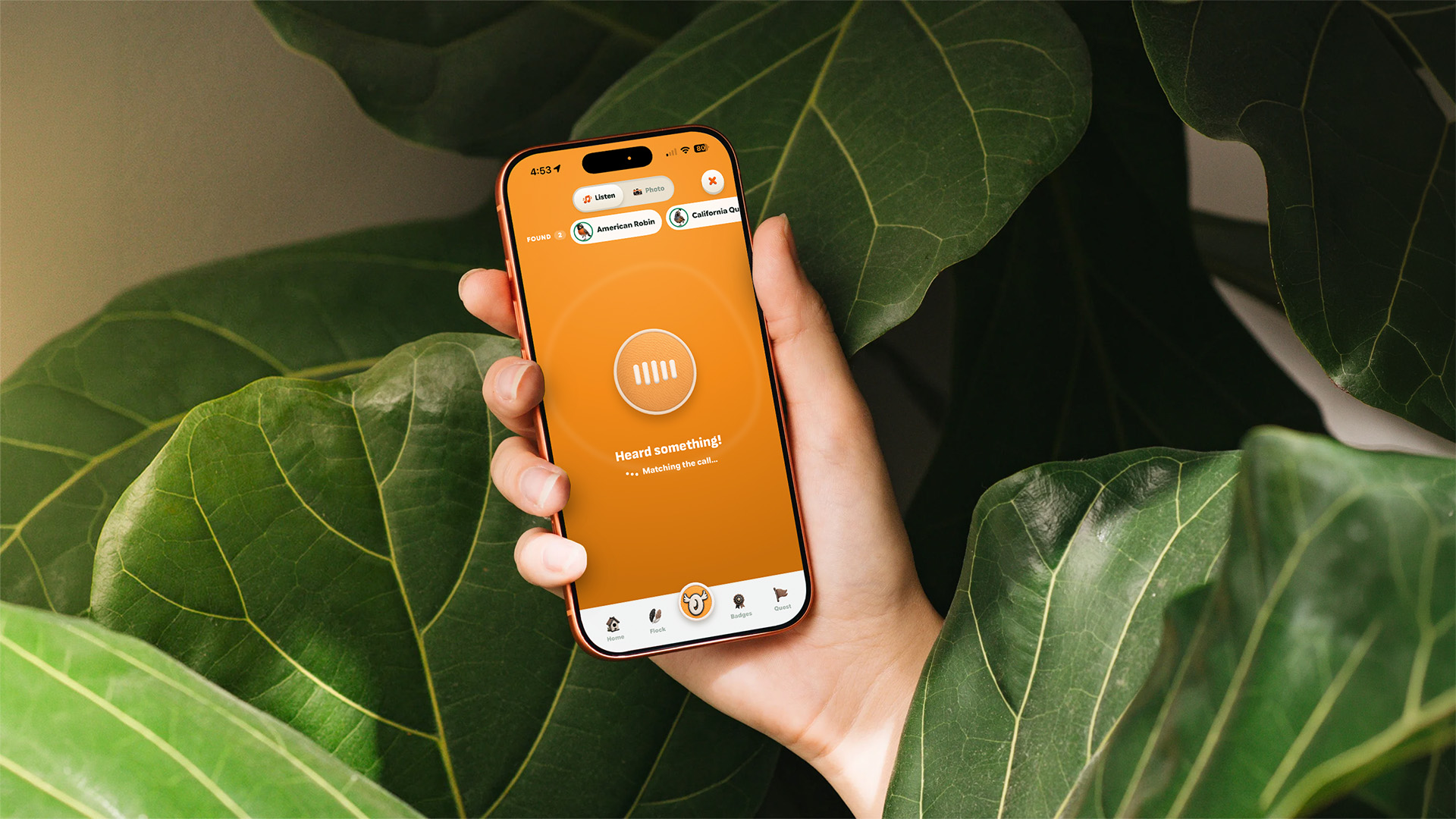
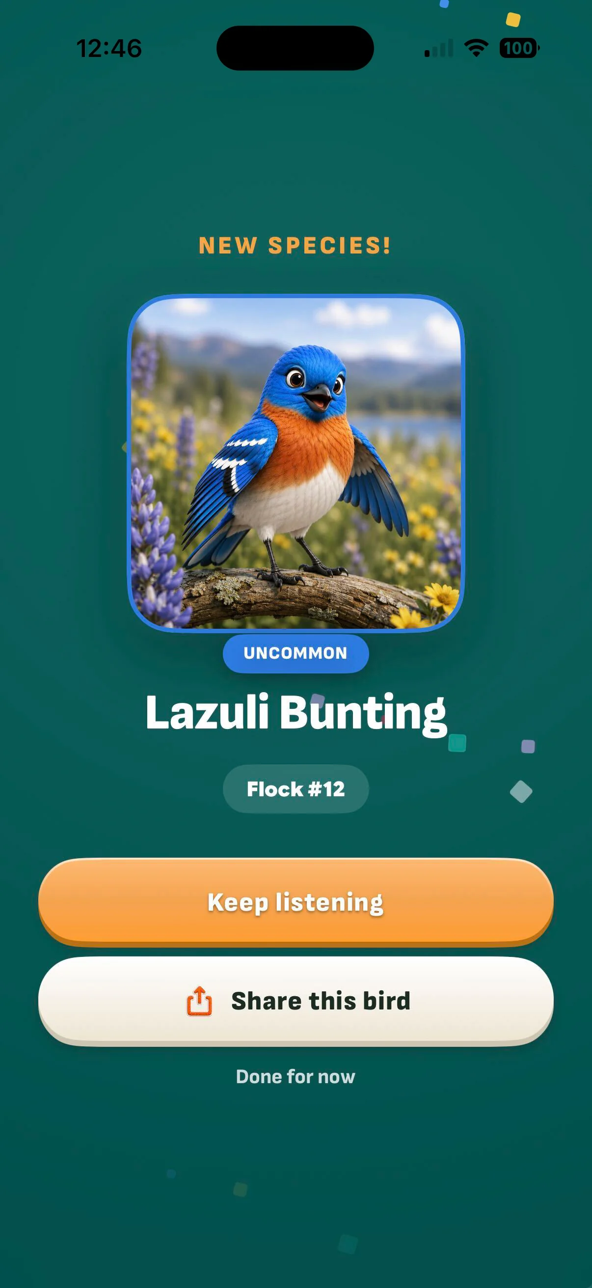
Two birds caught back to back. Catch a matching bird and the bird lands in your flock.
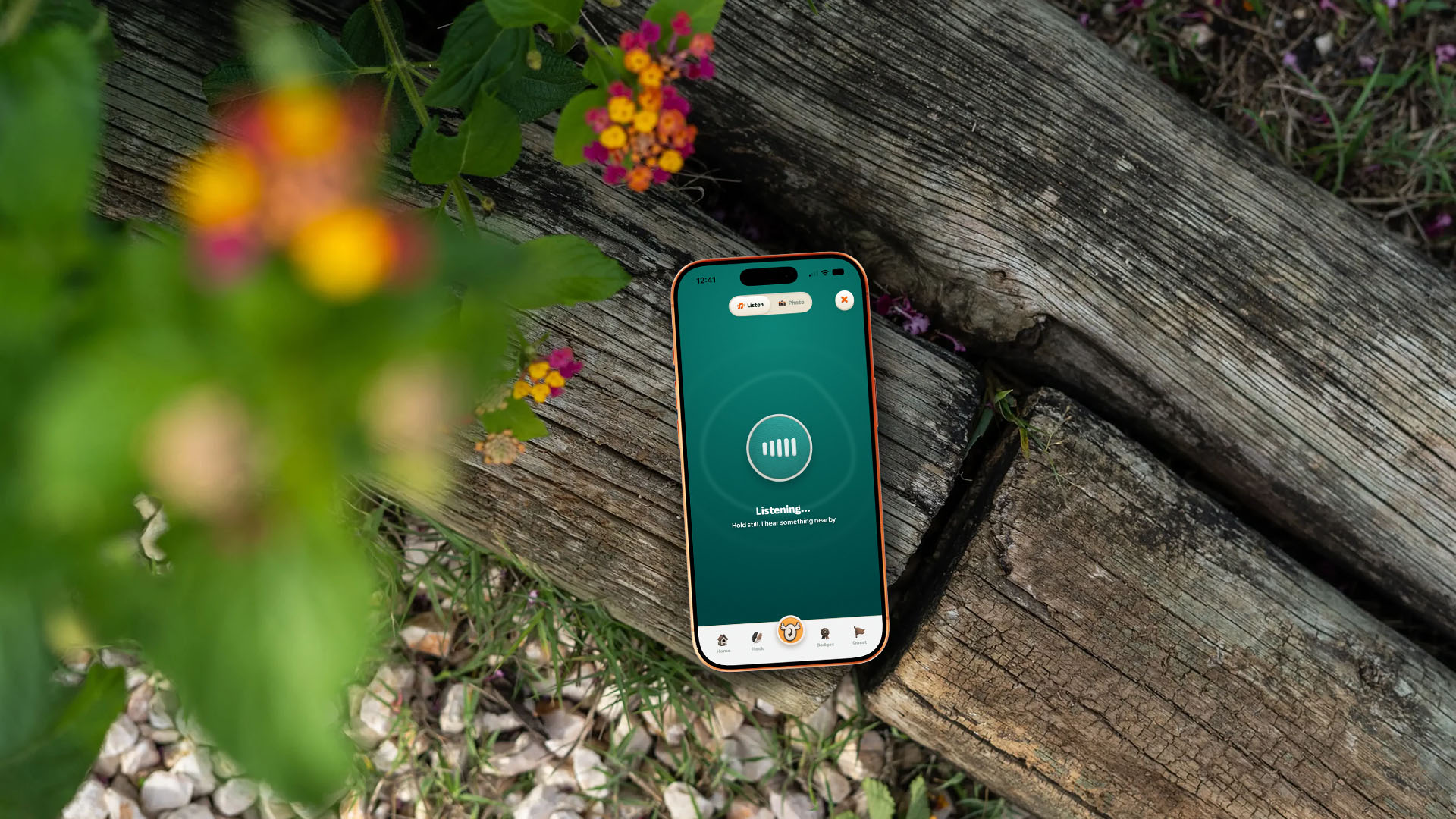
There’s nothing to operate in between. One tap to listen or snap, the match happens on its own, and the flock filling in is the reward. Short enough that a kid immediately goes looking again.
Structure
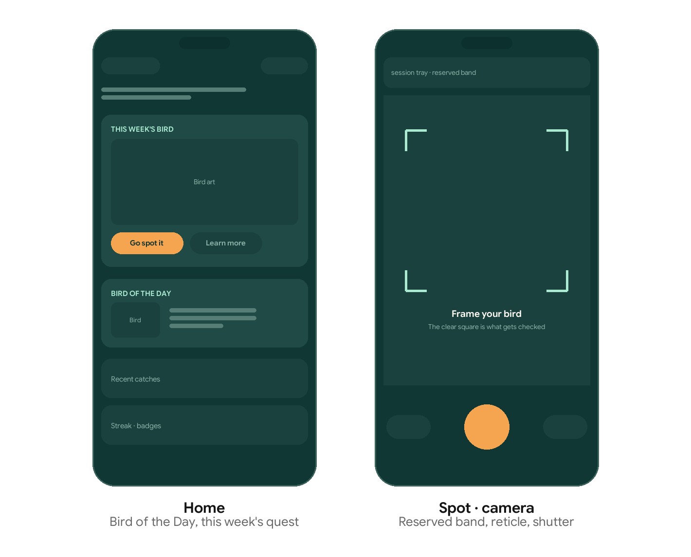
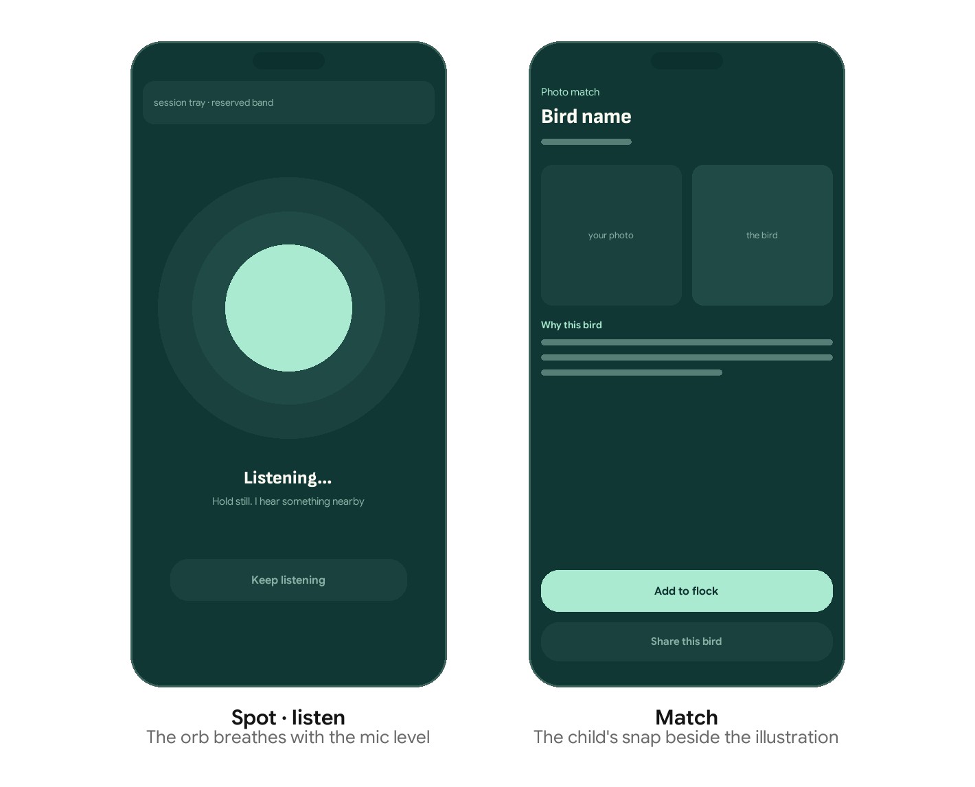
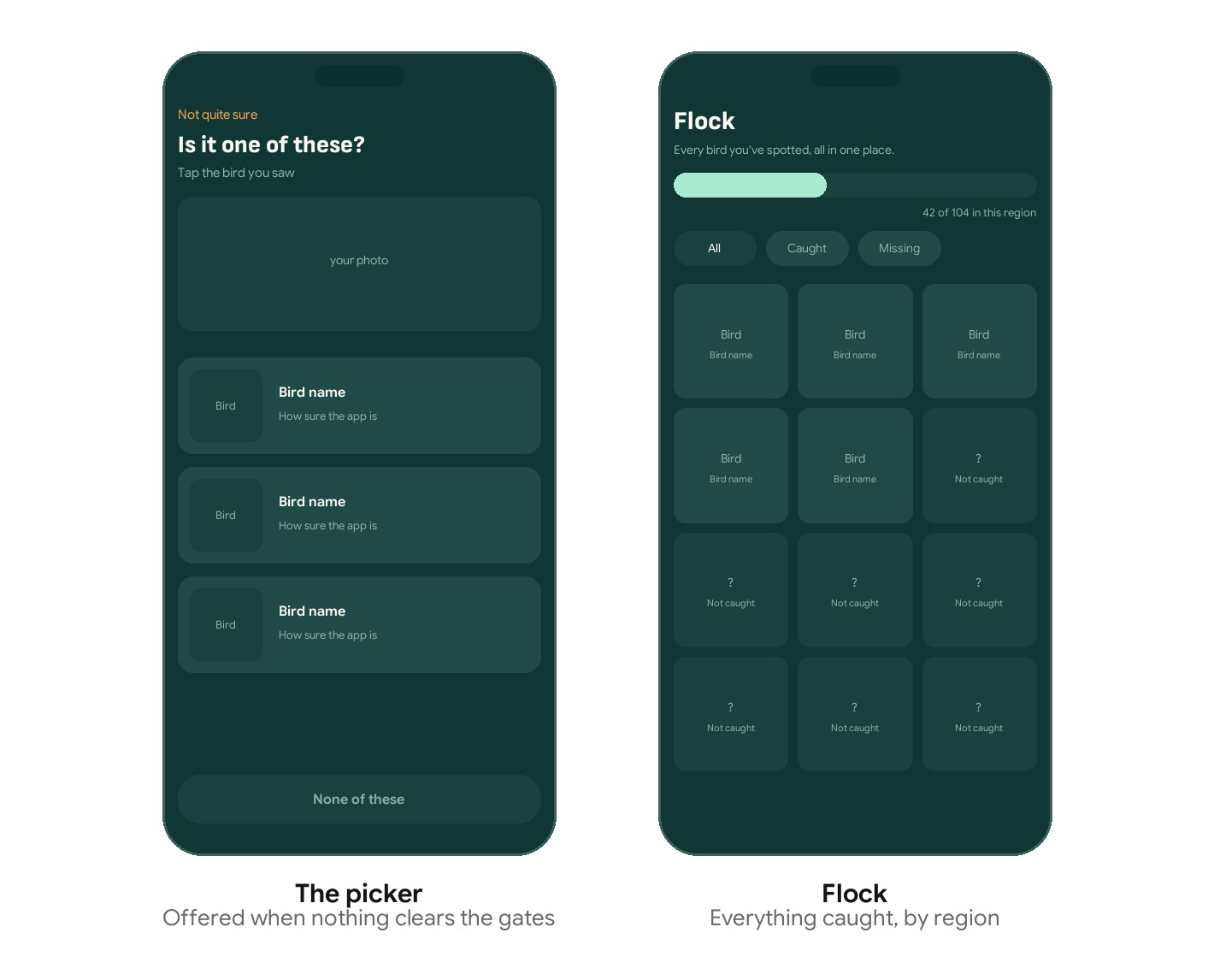
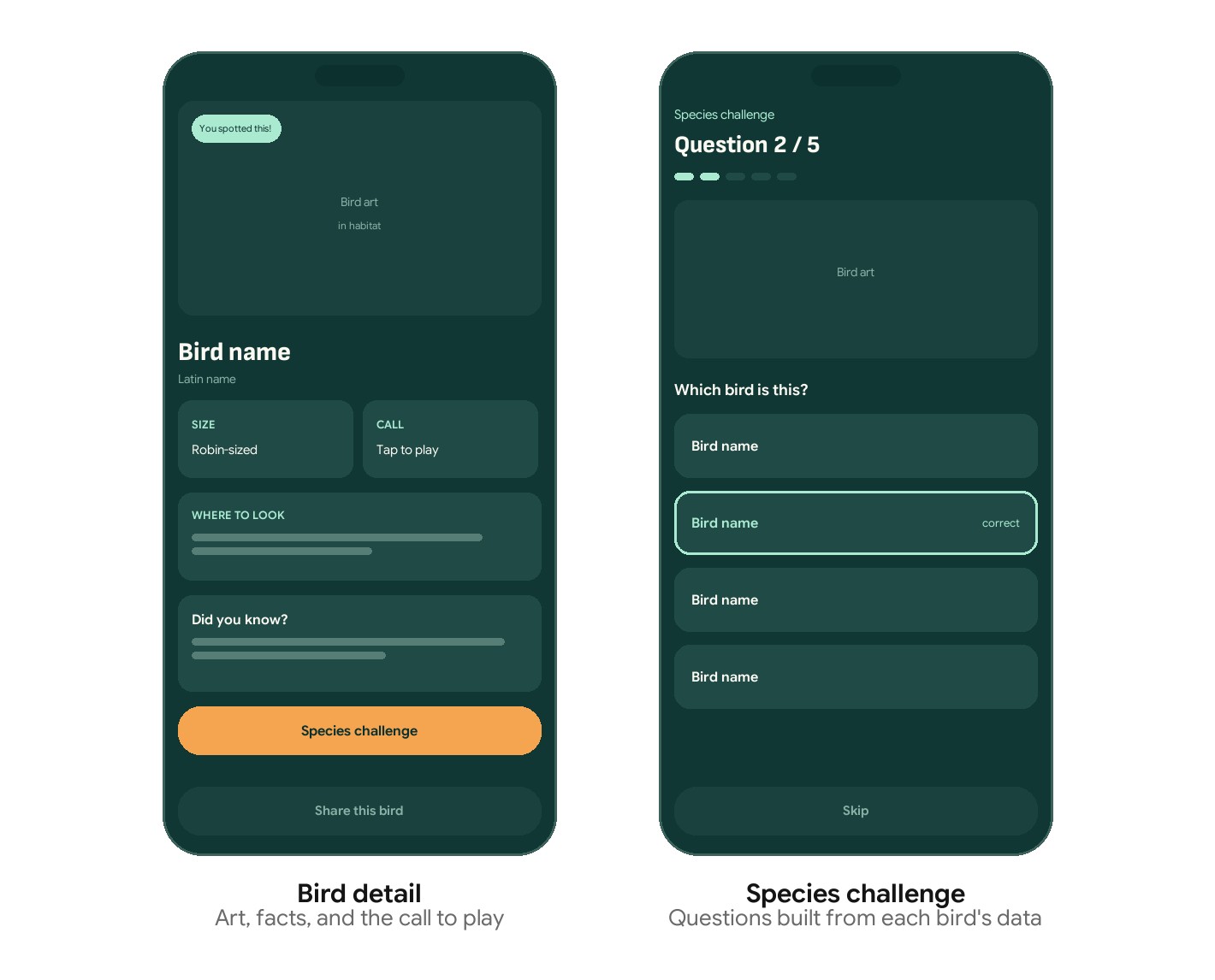
Eight screens, one loop
The whole app is a loop a kid can run without help. Spot something worth finding, go find it, get an answer, watch the flock grow, then learn the bird well enough to name it next time.
Only two of these screens do any identifying. The rest are there to make finding a bird feel like an accomplishment, and to give a reason to learn more about a bird they already caught.
The gate
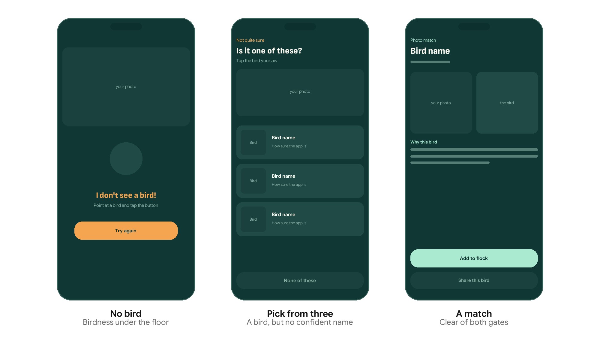
The three outcomes aren’t a technical detail. They’re three different things to say to a child, and each one needed its own screen.
“I don’t see a bird” prompts you to try again. “Is it one of these?” hands the decision over and teaches the real skill. A match goes straight into the flock.
The gap between the first two is the gap between a kid circling a wireless charger and a kid looking carefully at three sparrows.
Widgets
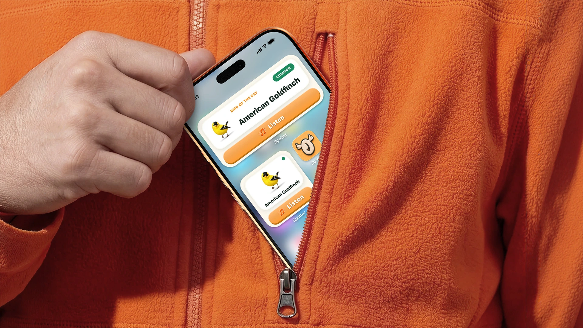
Two jobs. Today’s bird at a glance, and the shortest possible path into listening.
Bird of the Day seemed like the first obvious thing to show. It already changes daily and is tuned to your region, so the widget always has something new to say without asking anything of anyone. A Listen button sits underneath it, because a singing bird won’t wait while someone hunts for an app.
Brand
One mark, three jobs
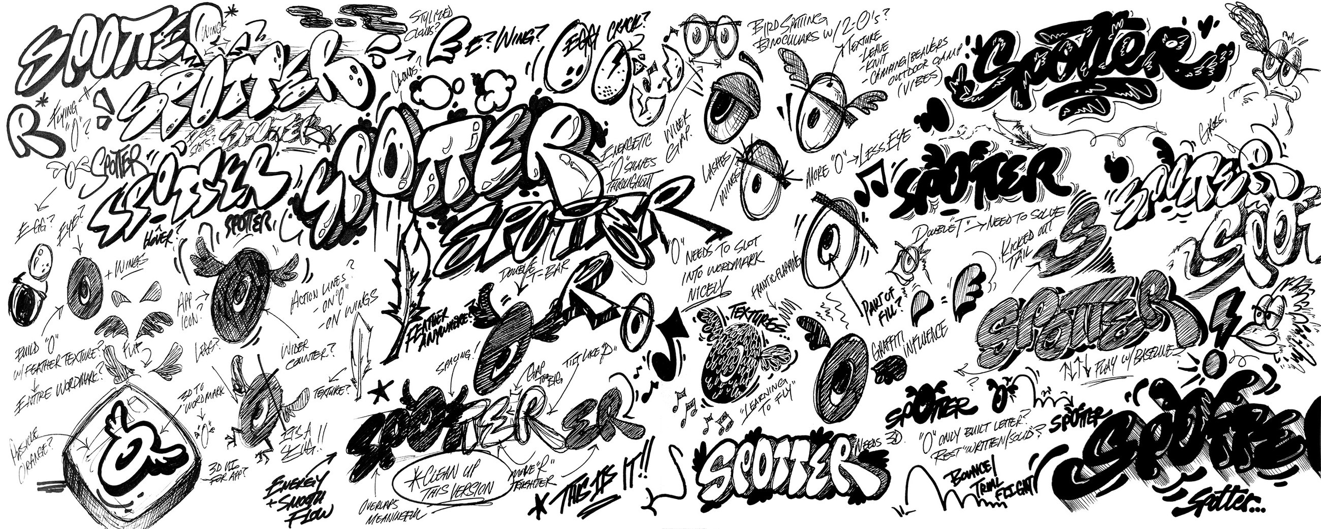
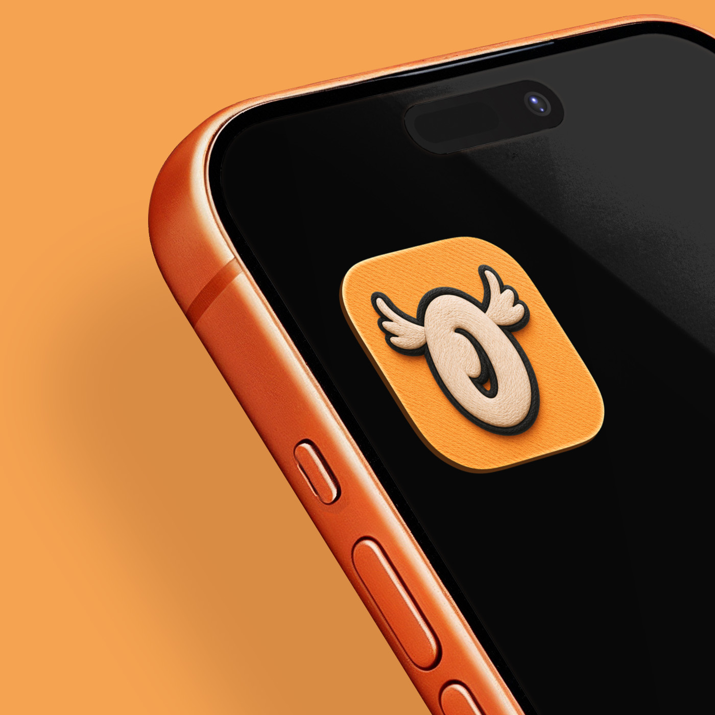
The identity had to work as an app icon, a loading state and a wordmark, so it started where those three overlap: the O in Spotter, opened up into a bird taking flight.
I sketched it by hand first. Dozens of passes, working out the general letter forms and where and how much personality to add. The mark needed to be playful, legible, and memorable. The “O” does most of the heavy lifting, and the moment it took flight, it was settled.
Where it landed
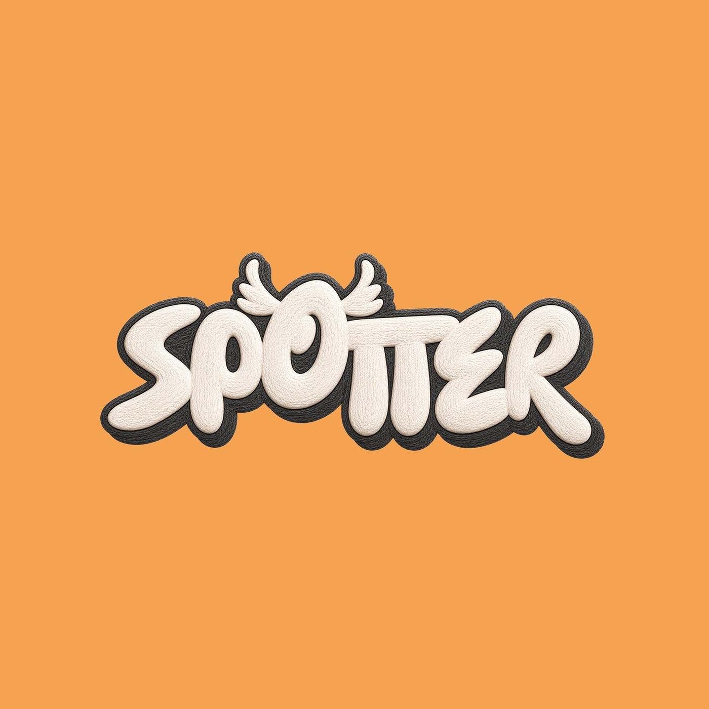
The finished mark lands playfully. A rounded, bouncing wordmark paired with the flying “O” that doubles as an eye, textured with a knitted feathered look rather than flat so it feels like an object a kid could pick up.
The O also comes away clean on its own, which is what makes it work as the app icon and as the loading animation. It lifts, hovers and settles with its wings beating, and it’s the first thing a kid sees.
The rest of the system
Deep teal ground, cream type, an amber gradient for buttons, and mint only ever on solid teal. Cards sit slightly off axis on purpose, and every button is a 3D press. That’s the playful side of the app, and a kid trusts something that looks and feels tactile. Motion is springs, not fades. Bird of the Day wiggles in, result cards pop, and the listening orb breathes with the real microphone level.
Typography
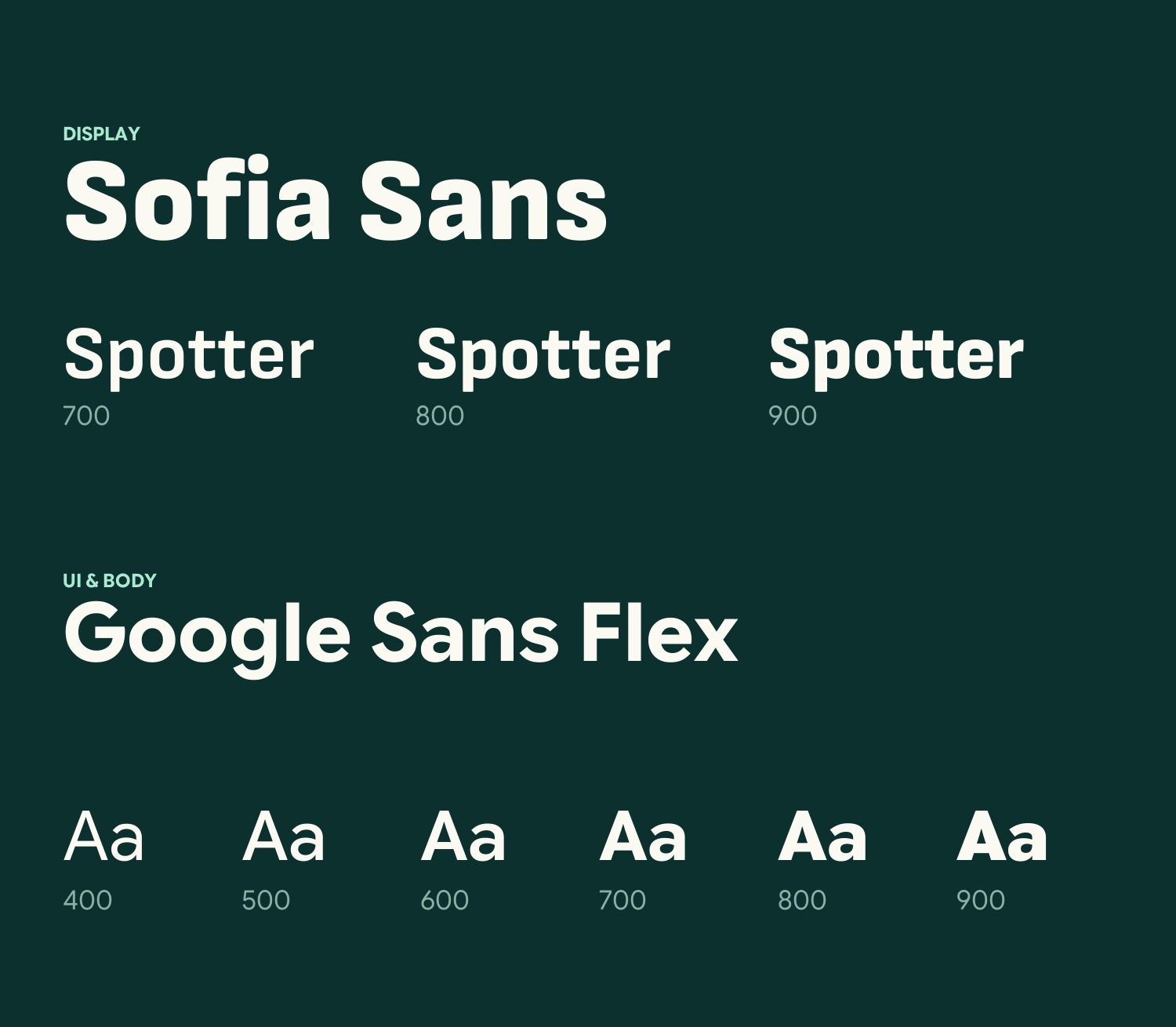
The type needed to carry personality but still be clear and legible for kids. Sofia Sans for display: heavy, rounded and friendly at size without becoming a novelty face. Google Sans Flex for everything a kid actually reads.
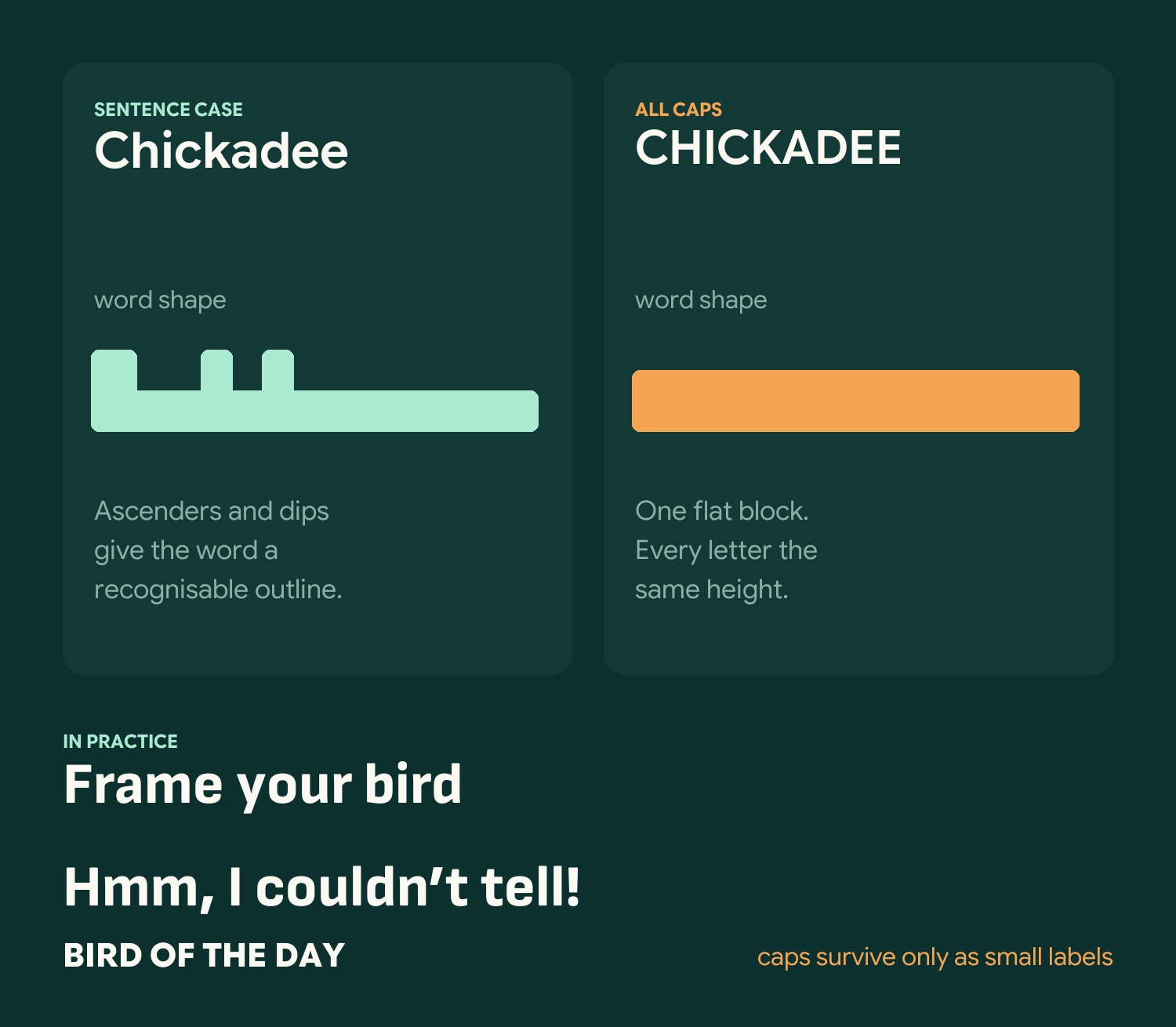
The case rule is the part that matters. ALL CAPS strips out ascenders and descenders, and those are exactly the cues a beginning reader is using. An adult reads the letters. A six year old is still reading the shape, and caps flatten it into one block. So caps survive only as small badge labels and rarity pills, never as something a kid has to read to play.

100+ birds, twice
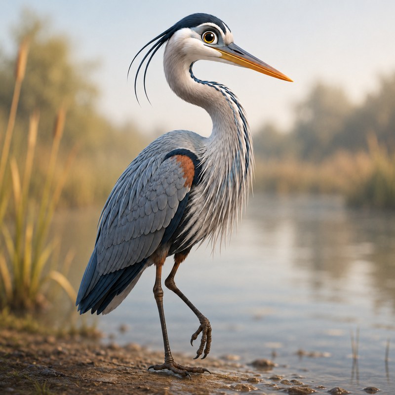
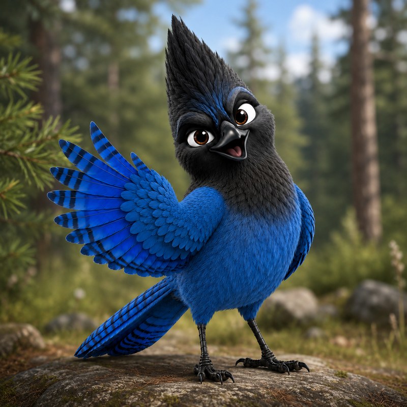
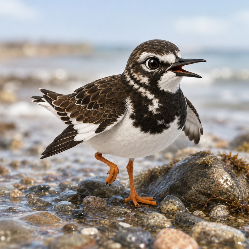
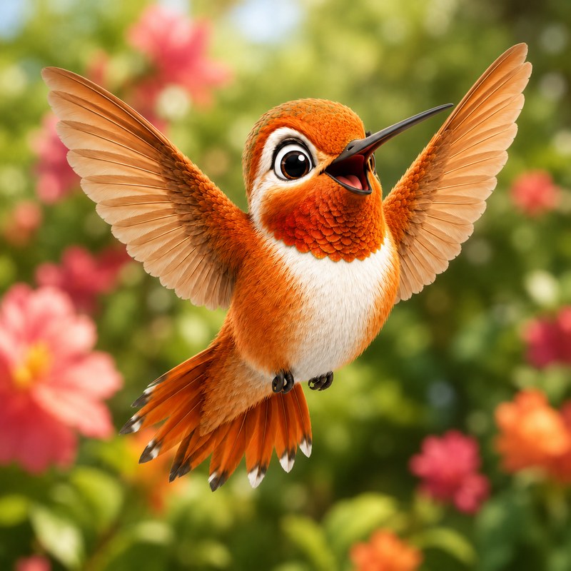
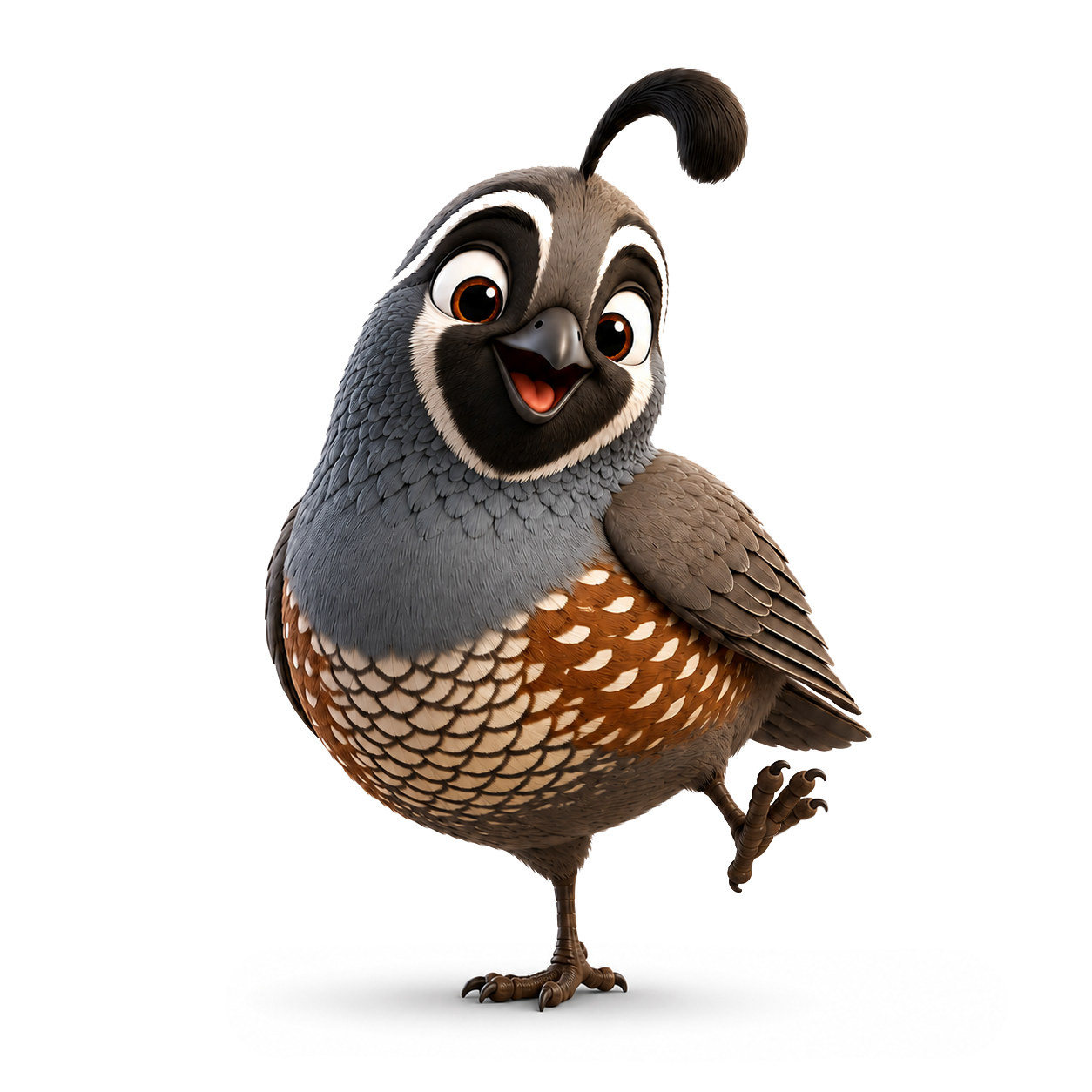
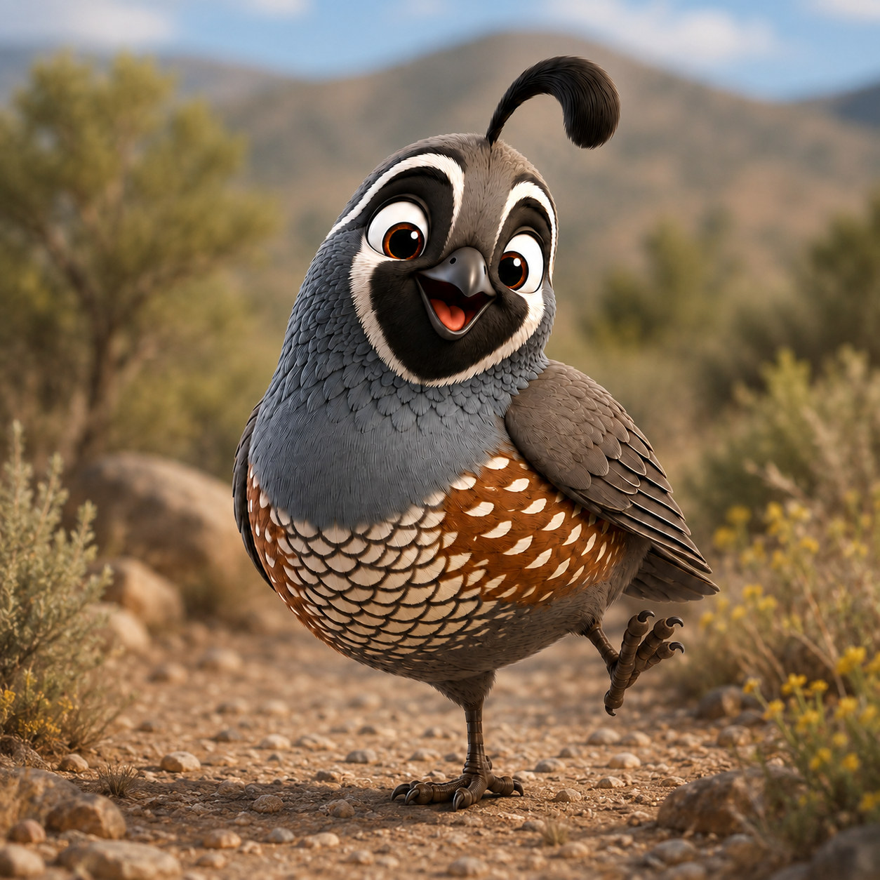
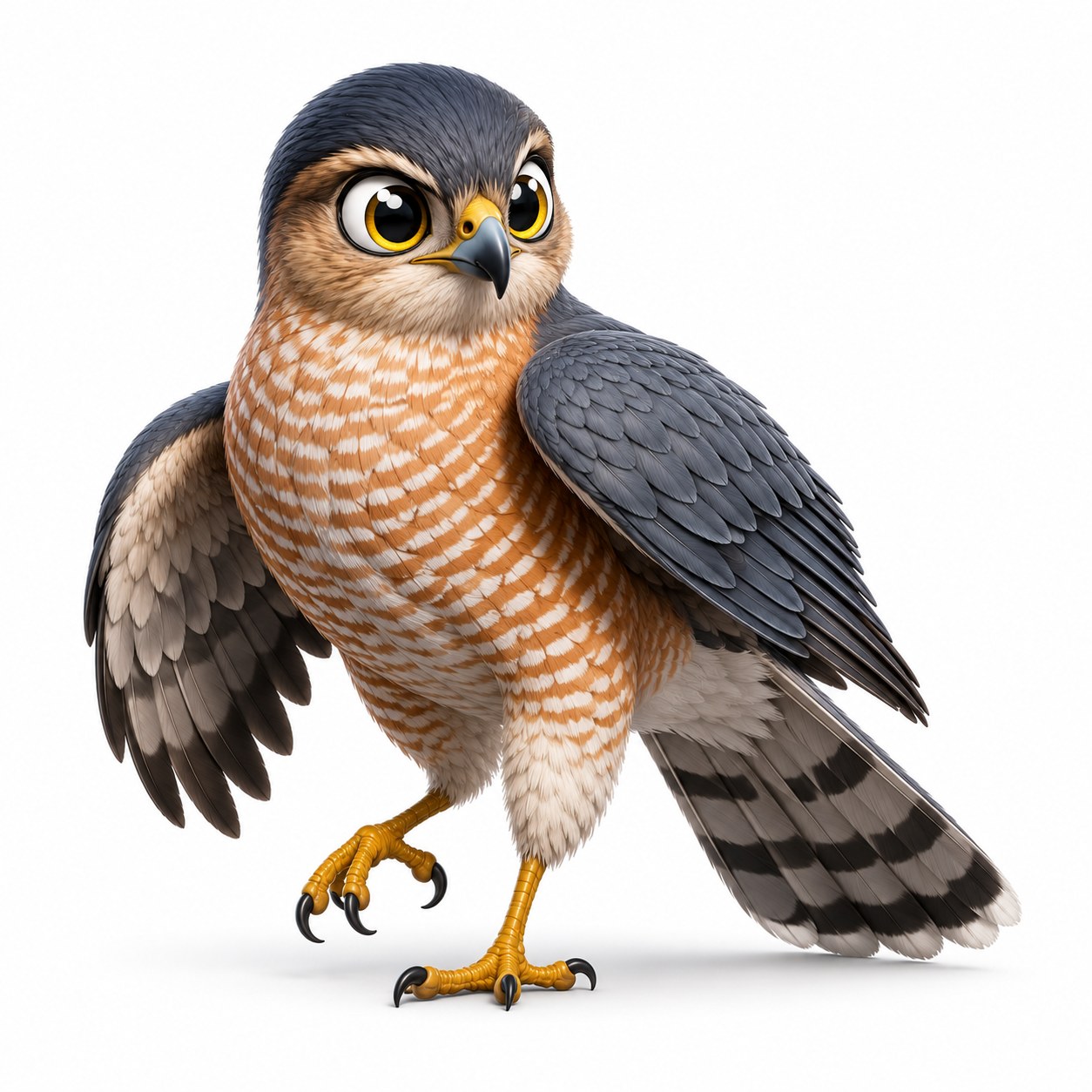
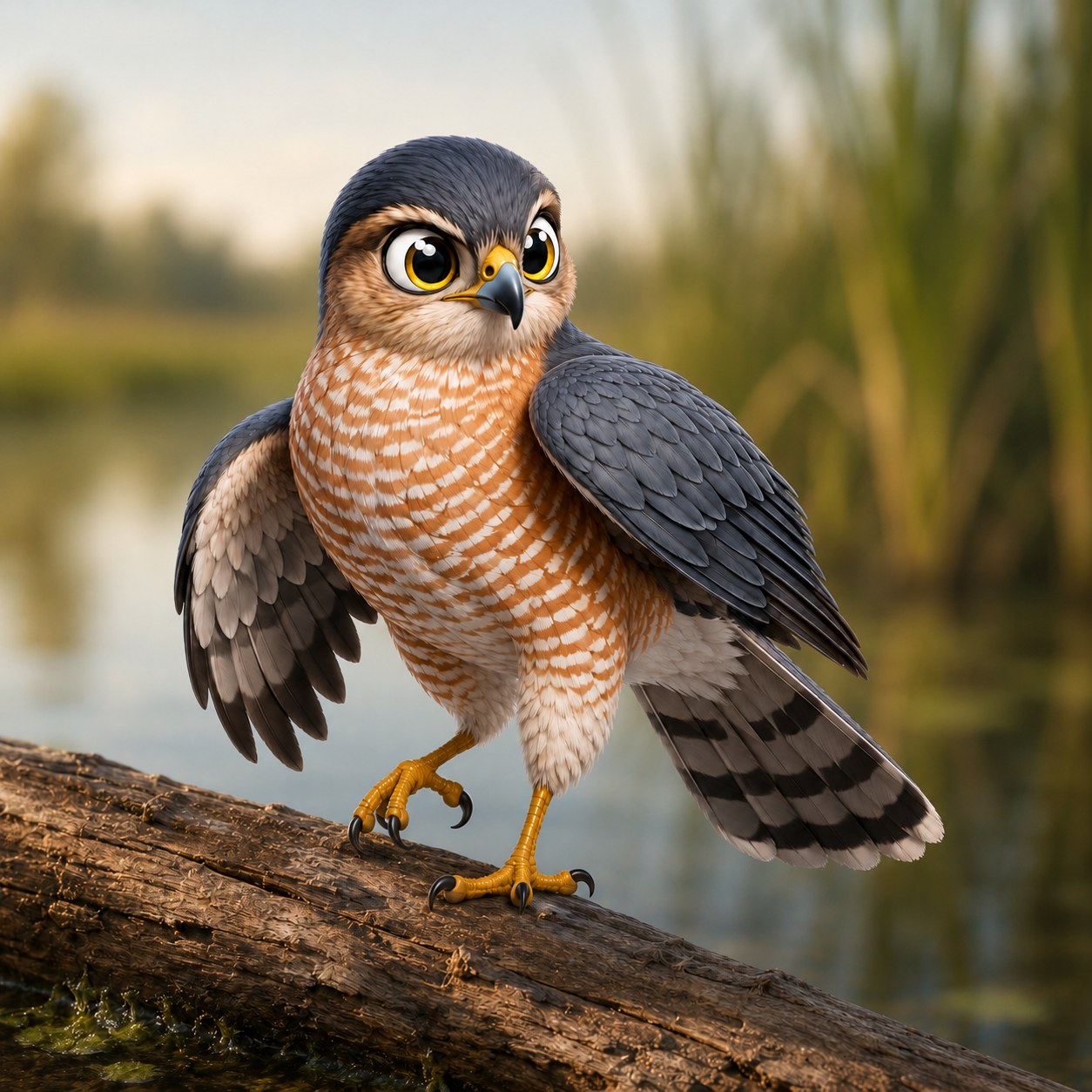
Every bird is illustrated to one spec. Same light, same pose, same relationship between bird and context. A collecting game is a set, and a set that doesn’t look like one isn’t worth collecting.
Each one is created twice. A studio cut out for the flock and the match card, where the bird has to be checkable against a real photo with nothing else competing. And a habitat version for the detail screen, where the point is where the bird actually lives.
Nine badges, and none of them for trying
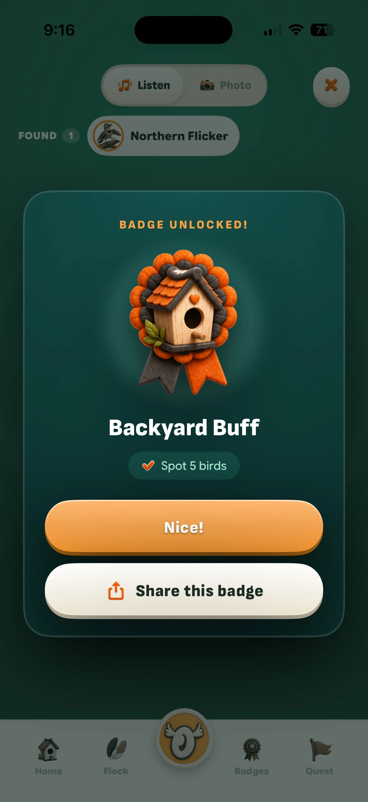
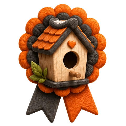
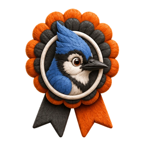
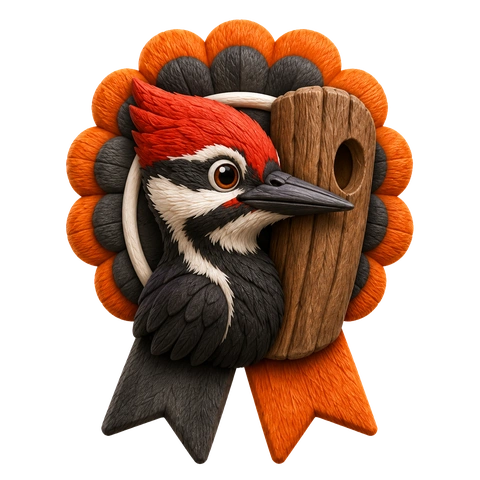
Every badge names something a kid actually did. First Catch. Early Bird, before 7am. Jay Walker. Seven days in a row. Legendary, for a bird most people never see.
They’re modelled in the same felted craft as the logo and icons because a reward has to look worth keeping. A flat icon set would have said progress bar. These say you won something.






Designing for a seven-year-old
Small decisions that only matter if you watch a kid use it
No system dialogs in kid flows
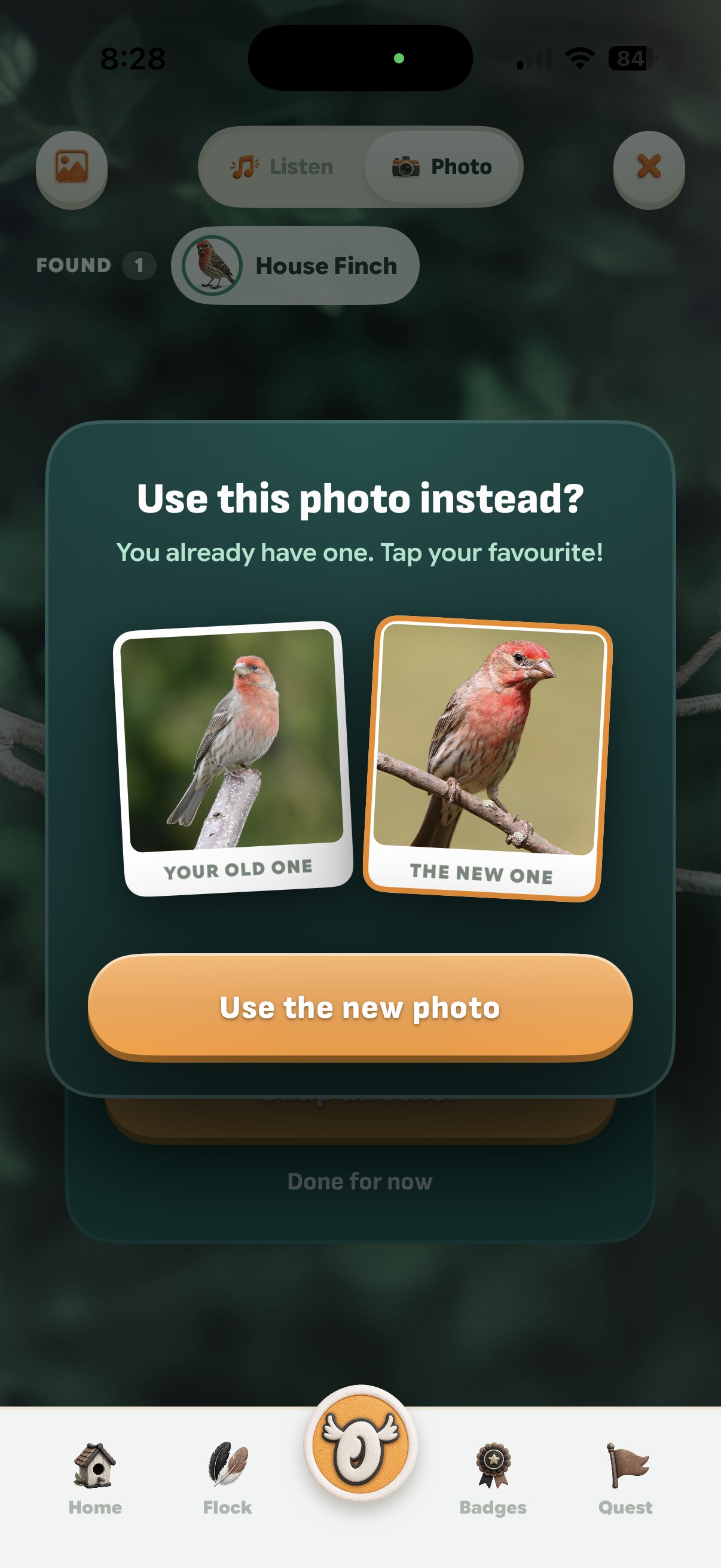
Recent iOS anchors confirmation dialogs to their source as popovers, and popovers hide cancel buttons. I watched a kid get stuck in one.
So we built our own. A dimmed screen, centred card, every choice a full button, tapping outside is always the safe way out. In the replace-photo modal the photo itself is the button, so a kid never reads an option to choose it, but sees it instead.
Show, don’t tell
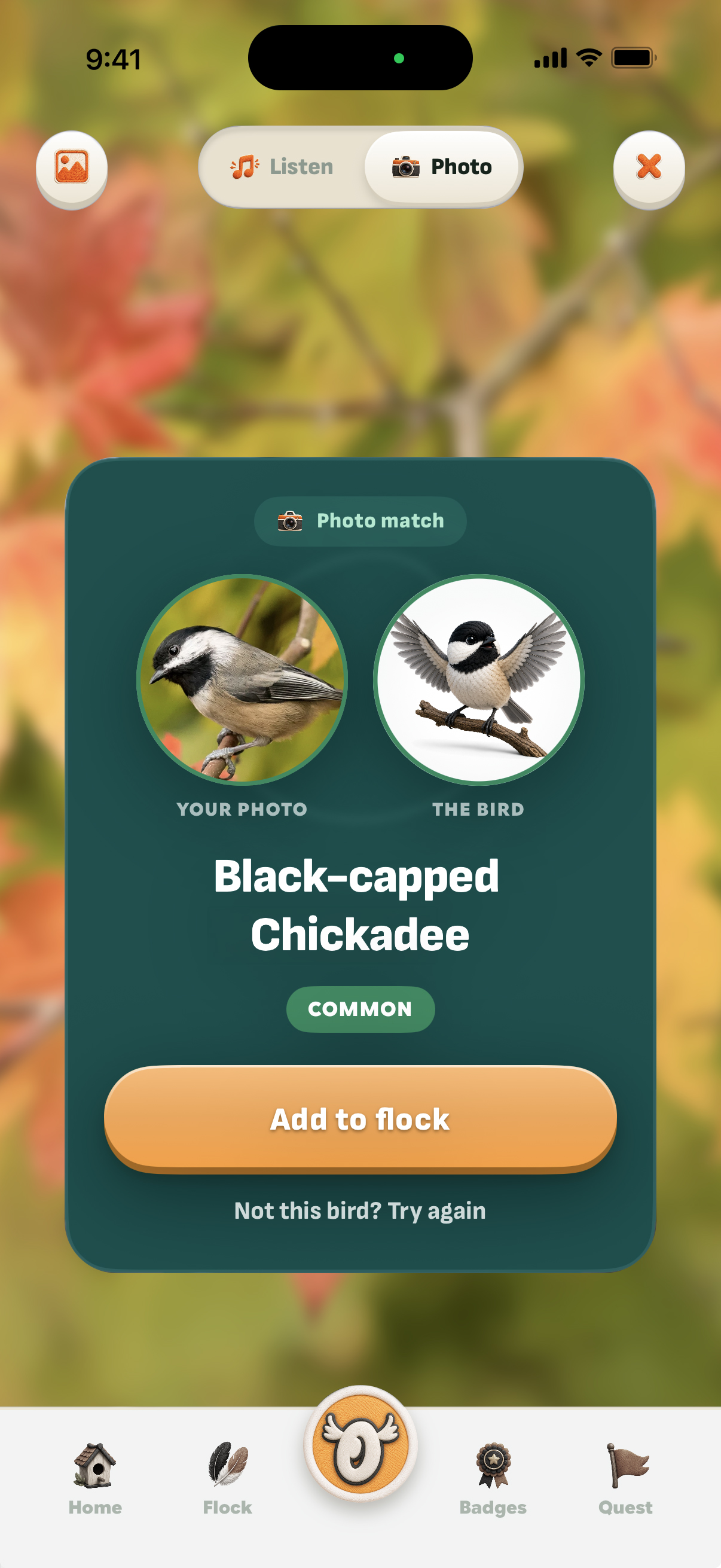
The match card puts the kid’s own photo next to the bird’s illustration, because “is it this bird?” should be answerable by looking.
A robin matched as a Varied Thrush is impossible to check if you’ve heard of neither. With the art right there for comparison and confirmation, the mismatch is obvious without reading a word.
Onboarding ends on the payoff
Four short screens. What this is, which region you’re in, the two ways to find a bird, and why.
Without that last screen the app reads as a tool that identifies birds. With it, it’s a game about collecting them. Those four screens are the difference between a utility and a reason to go outside.
The architecture
Four gates, each one forced by a failure
01
Is it even a bird?
The AI confidently misidentified a phone charger as a sparrow. Lowering thresholds can’t fix a confidently wrong model, so it now verifies “is it a bird?” first.
Non-birds score under 0.011 while real birds score above 0.19, creating a clear cutoff threshold at 0.05.
02
Three answers, not two
A strict pass or fail confuses users, like telling a kid to move closer to a charger.
The system now returns three distinct states: exact match, “No bird detected”, “Bird detected, but unidentifiable”.
03
Turning dead ends into user choices
Low-confidence results were previously discarded as errors.
Now, the system shows the user the top three guesses so they can select the correct bird themselves.
04
Safeguarding the choices
Unfiltered choices caused absurd suggestions, like guessing a common sparrow was a rare “legendary” duck.
To fix this: the top option must hold at least 25% confidence to show the choice menu. Legendary birds are completely excluded from suggested guesses.
Two ways to catch a bird
Lessons from testing two models in the field
Different approaches, same outcome: real-world testing breaks lab assumptions.
By photo
A custom classifier trained strictly on the game’s bird list, then re-ranked based on the child’s location.
By call
BirdNET runs locally on the phone, analyzing rolling 3-second audio clips. Though it recognizes 6,500 species, Spotter restricts its answers to the birds in the game.
Spotter’s listening layer
Peak-volume scaling. BirdNET struggles with quiet audio because it was trained on close-range calls. Spotter normalizes every 3-second audio window to a peak volume before processing, with a ceiling to avoid amplifying silence into background noise.
Smart pause tolerance. Songbirds pause for 8–12 seconds between calls. Rather than giving up during gaps, Spotter decays scores slowly, holding a match across quiet pauses.
Custom listening layer. Volume scaling, pause tolerance, and score decay form Spotter’s proprietary wrapper built around standard BirdNET.


Trained on portraits, not real photos
An ordinary photo of a robin on a lawn consistently failed identification. Training data was sorted by community favourites, so the model learned to recognize professional bird photography instead of birds. It failed on distant, real-world shots taken by kids.
Retraining for real-world input. Adding casual, unranked photos to weak species categories solved the issue. Instead of returning a single confidently wrong answer, the same robin photo now returns a spread of low-confidence scores.
A safer outcome. Because no species clears the automatic threshold, the app opens the selection picker with the robin listed as a choice.
62–72%
Validation accuracy variance on identical training data
Top scores failed in product. The highest-scoring model proved useless because its top choices were too close to clear the app’s decision gates. Models are now selected across multiple runs, never a single metric.
Location-based weighting
Before ranking, species scores are multiplied by local bird frequency. Common local birds retain full points, while rarer species are scaled down.
Out-of-region birds receive a 0.15 multiplier, never zero, allowing for rare vagrants. An out-of-region bird simply must be distinct enough to outscore local species.
Where you stand re-weights every score
Privacy
No accounts. No analytics. Not one network call. Every identification happens on the phone. Spotter collects nothing, because it was designed that way.
How it was made
The device is the ground truth
Forty-two of the first 155 commits came from field testing on physical hardware, exposing edge cases synthetic lab tests missed.
Three rules emerged:
- Mock layouts before compiling: Preview UI directly from live data to spot visual flaws without waiting on full app builds.
- Measure from source, not screenshots: Guessing aspect ratios from static mocks invented a cropping bug that became a real defect when “fixed.”
- Measure before guessing causes: Blaming a 3.4-second camera stall on Bluetooth and permissions was wrong. Timing every step proved
inputNodecaused the entire delay, leading to a one-line fix at app launch.
Starting the microphone, step by step
Working with AI
Design and field evidence
Spotter was built with Claude across 235 commits. I handled the brand design, UI, product taste, field evidence and testing, critical corrections and direction. The AI wrote the code and priority sequencing.
Issues like misidentifying a phone charger or trapping a user in a dialog happened because the AI made logical assumptions that failed on real hardware. The model can write code, but it cannot predict how a child uses a phone outdoors.
To maintain context, every trade-off was documented directly in code comments alongside the real-world failure that caused it. Capturing that reasoning in the moment is what made this case study possible weeks later.
What changed along the way
Things I tried, and what they became
01
Confidence thresholds alone
A wireless charger cleared both gates as a sparrow.
Presence check before identification
02
Classifying the full camera frame
Reticle promised a crop the pipeline never took, analyzing gravel instead.
Crop to reticle at measured coordinates
03
Offering top three species on low confidence
Out-of-game birds returned three unrelated species, including a legendary.
Require 0.25 leader margin, exclude legendaries
04
Framing stage inside layout column
Photo was beheaded at stage ceiling across three consecutive builds.
Fullscreen canvas with floating controls
05
Session tray floating over camera
Status chip clipped directly into the top-left bracket.
Permanently reserved UI band
06
System confirmation dialog
Popover obscured cancel button and trapped a young user.
Custom image-based modal
07
Blaming Bluetooth for 3.4s stall
Timing revealed Bluetooth, permissions, and audio setup were all innocent.
Instrument every step; fix audio input unit
Where it landed
An app that says “I don’t know” well
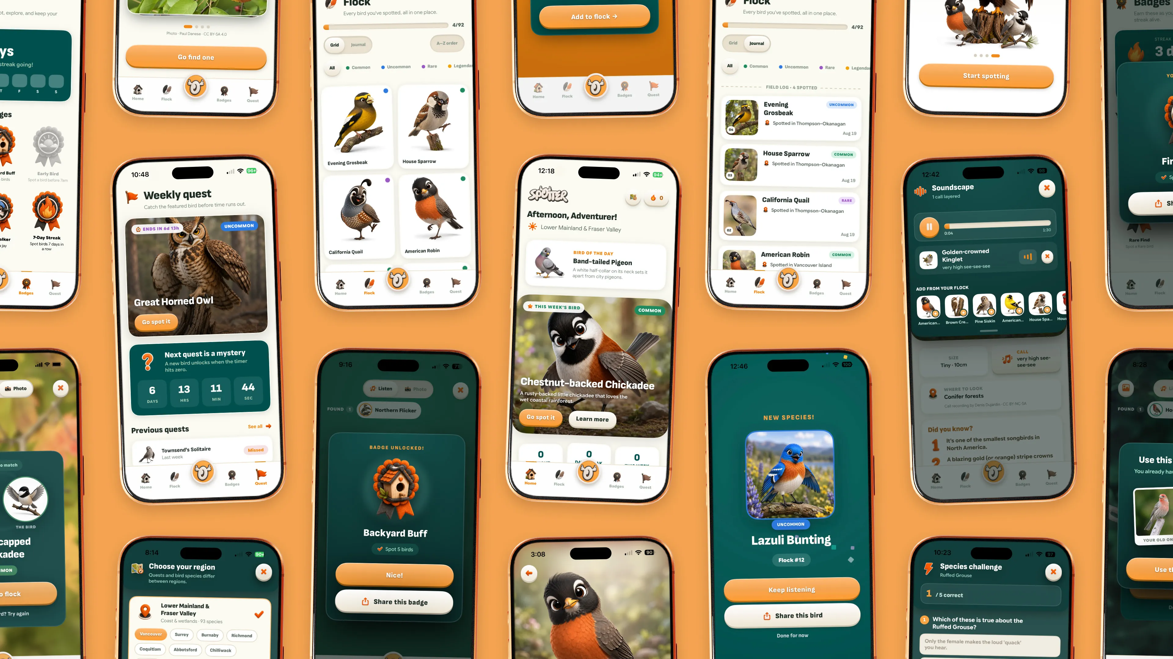
Spotter launched with over 100 birds across four regions, two ways to catch them, a flock, badges, weekly quests, quizzes, and share cards. Brand, interface, image creation for badges, icons and birds, and the implementation are all mine.
What stands out isn’t the feature list. It is that the app holds a clear stance on its own uncertainty, which it earned by failing in front of a child and fixing it three separate times.
Every safety check in the pipeline started as a real-world mistake: a charger on a desk, an unlisted sparrow, a modal with no exit. The app is honest because the person it was built for kept catching it when it wasn’t.